
Why Businesses Regret Treating Their Website as a One-Time Project

Why Businesses Regret Treating Their Website as a One-Time Project

Have you ever spent months building your website, eventually hit publish, and thought “okay, we’re done here”? A lot of businesses do, and honestly, we get it. The launch feels like the finish line, so it makes sense to move on.

But your business website design does not stop working for you on launch day. There’s ongoing work that keeps it competitive, secure, and relevant. After all, browsers change, security threats grow, and your competitors are not standing still.

We see this play out all the time at Westport Osprey Web Design. This article covers why leaving your website on autopilot is one of the most common and costly mistakes a business can make.

Web Design Does Not Stop at Launch

Most businesses treat their website like a renovation project. You plan it, build it, hand over the keys, and move on. But a website usually doesn’t work like that, because the work that keeps it performing doesn’t stop once it goes live. Step back for too long, and it starts costing you in ways you’ll not always see coming.

Here’s where businesses feel it most.

Why Site Maintenance Gets Ignored (And What It Costs You)

Site maintenance rarely feels urgent until something actually breaks. We’ve worked with businesses in Westport who went years without touching their site, only to discover hacked pages, broken links, and a spiraling bounce rate.

What most of them didn’t realize is that easy to maintain doesn’t mean zero effort. When you skip security patches, you leave your site open to vulnerabilities hackers actively target, and that’s the worst-case scenario for any website owner.

Bug fixes pile up over time too. Each unresolved issue adds friction to the user journey, and anyone who hits a broken or sluggish page rarely sticks around. Ultimately, skipping the technical side altogether means great content stops converting, and data loss becomes a very real concern.

What Web Developers Are Actually Responsible For

Usually, web developers handle uptime monitoring, browser compatibility, security updates, and performance fixes long after launch. Their clients never see what happens behind the scenes of a professional website build, but that work is what keeps everything functioning properly.

And here’s the thing: browser updates roll out constantly. A site that worked perfectly six months ago can start throwing errors across devices with zero warning. That’s why ongoing web development goes well beyond writing code, covering:

  • Testing pages across devices and browsers
  • Monitoring uptime and flagging outages before visitors encounter them
  • Reviewing site architecture and internal links to support search engine crawling
  • Flagging technical issues before they affect your visitors

Think of web developers as the crew running things around the clock. Nine times out of ten, the businesses with the most stable sites are the ones who never let that relationship go.

Your Business Website Design Won’t Age Well on Its Own

Business Website Design Needs to Update

A website built two years ago already looks and feels different from one built today. Business website design moves fast, and what felt modern at launch can start looking stale to visitors well before you notice. That’s a wake-up call most businesses receive too late.

Let’s be real here. Outdated design doesn’t just look bad; it tells potential customers that your brand has not kept up, and that doubt tends to set in before they even get to your content. And first impressions on a website work the same way they do in person. You get one shot, and a dated layout wastes it.

Now, keeping things fresh does not mean rebuilding from scratch every couple of years. Simple updates to layout, typography, and visuals cover a lot of ground.

For example, cleaner fonts make content easier to scan because readers process well-structured text faster and spend more time on the page. The same goes for spacing and visuals. When those feel outdated, people lose confidence in your brand.

What Google Analytics Reveals About Your Website Performance

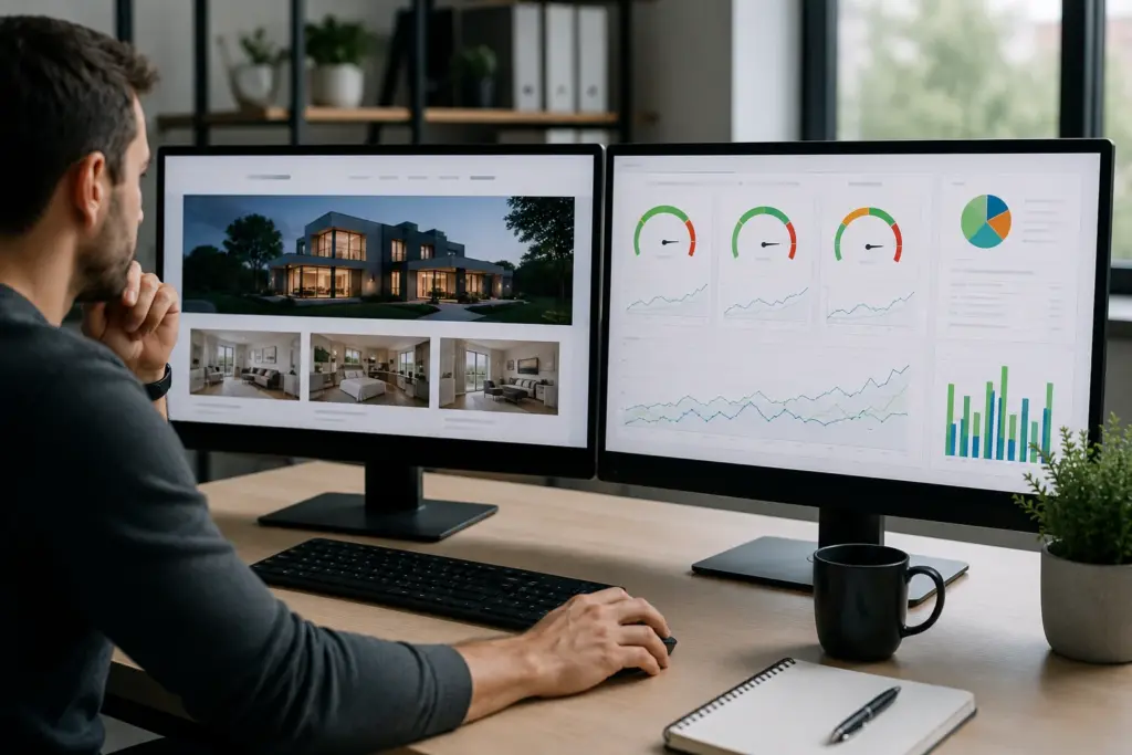
Google Analytics (GA) sits on the backend of your site, collecting real data continuously (and what it reveals isn’t always a pretty picture). It tracks user behavior, web traffic, and site performance in detail, so you know exactly what’s happening across your pages at any given time.

Business Website Design: What Google Analytics Reveal About Performance

Here’s how to get in there. Open Google Analytics → Dashboard → Reports → Acquisition to see where your traffic is coming from. Then go to Reports → Engagement to check which pages keep visitors engaged and which ones lose them quickly.

And if you run an online store, head to Reports → Monetization to see where revenue is dropping off. Pull up any of those tabs, and you’ll find data covering five areas worth paying close attention to:

  • Top-Performing Pages: Some pages pull in consistent visitors and keep them engaged. Others bleed traffic within seconds, and knowing the difference tells you where to invest and what to cut.
  • Traffic Origins: Search engines, social media, and ad campaigns each behave differently. Splitting them out shows which channels drive real results for your business.
  • Content That Needs Work: User feedback patterns flag website content that has gone stale. Outdated product descriptions, thin pages, and posts that no longer match search intent are common culprits.
  • SEO Red Flags: Your website’s SEO health shows up clearly here, including pages dropping in rankings, high exit rates on key landing pages, and slow load times.
  • Revenue Gaps: For e-commerce businesses, dips in online sales often connect directly to a poor site experience that analytics can pinpoint quickly.

When you can see exactly where your site is losing people, fixing those gaps becomes focused action rather than guesswork. And focused action requires the right people in place, which is exactly what the next section covers.

Working With a Web Development Agency vs. Hiring Someone Once

Hiring a web development agency and hiring a freelancer once are two very different commitments. One is a project. The other is a partnership. And for most businesses, that distinction has a significant impact on how well their site holds up.

The table below gives a quick breakdown of how the two compare:

One-Off HireWeb Development Agency
InvolvementEnds at deliveryOngoing relationship
ExpertiseVaries by individualFull team with technical expertise
ServicesLimited to agreed scopeWeb development services across design, SEO, and more
AccountabilityHard to reach post-projectDedicated client support
ScalabilityStarts over each timeGrows alongside your business

A one-off hire delivers a finished product and moves on. A web development company, on the other hand, focuses on where your site needs to go next. That covers ongoing performance reviews, content updates, a professional website build, and even mobile app development for businesses ready to grow their digital presence.

That’s exactly the kind of long-term partnership we build at Westport Osprey Website Design. Our partners stay invested in your results well after the project wraps up, and that is the mutual benefit most businesses miss out on when they hire someone once and move on.

Bottom Line: Hiring once saves money upfront, but commissioning new work every time something breaks costs significantly more. So a development agency that knows your business inside out is worth far more over time than a cheaper option with no continued involvement.

Now that you know who should handle the work, the next question is what that work covers on a regular basis.

The Different Types of Website Updates Businesses Tend to Skip

Different Types of Website Updates Businesses Tend to Skip

Different types of updates serve completely separate purposes. Security keeps your site protected, performance keeps it fast, and content keeps it relevant. So if you let one area go, the others will start feeling the pressure too.

Take a look at what a solid website maintenance routine covers:

  • Security Updates: Firewalls, SSL certificates, and access permissions need regular attention. Your web hosting provider covers some of it, but the remaining gaps still need someone actively checking them on your end.
  • Performance Optimization: Most visitors won’t wait more than three seconds for a page to load. Page speed, server response times, and image compression all play a role, and a content management system makes staying on top of all three far more manageable over time.
  • Content Management: Outdated information on your pages tells visitors your business isn’t on top of things, and that alone is enough to make them click away. Auditing your content regularly and keeping your content management system error-free are the two habits that prevent that from happening.
  • Bug Fixes and Testing: A glitch that goes unfixed for weeks creates friction at exactly the wrong moment. Regular browser and device testing catches these issues early, long before they start costing you visitors.
  • Web Hosting Reviews: Your hosting plan is worth revisiting at least once a year. Speed, security, and uptime demands shift as your business grows, and an outdated plan quietly holds your site back without any obvious warning signs.

Believe it or not, handling these updates proactively takes far less time than untangling them after something goes wrong. We recommend you address them one step at a time to beat a costly recovery effort later.

Ready to Stop Treating Your Website Like a Finished Product?

A website isn’t a one-time investment. It’s an ongoing commitment, and the businesses that treat it that way are the ones that stay competitive, relevant, and visible in search results year after year.

Managing site maintenance, running performance reviews, and keeping pages up to date on top of everything else is a lot to handle alone. But the right web development company takes that pressure off and keeps your site consistently moving forward.

At Westport Osprey Website Design, we work with businesses across Connecticut to keep their sites performing well beyond the initial build. If your website has been sitting untouched for a while, that is worth addressing sooner rather than later.

Reach out to our team today, and let’s talk about what your site needs right now.

homepage design

Why Businesses Struggle to Explain What They Do on Their Homepage

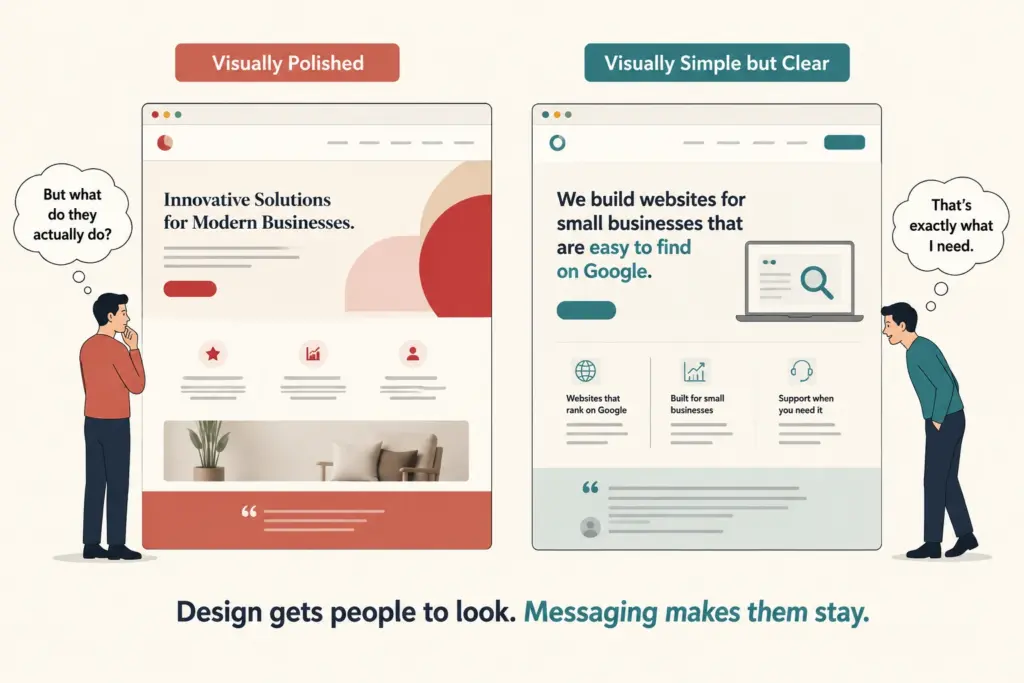
Businesses struggle to explain what they do on their homepage because they know their own work too well. The more familiar you are with what you offer, the harder it gets to explain it the way a stranger needs to hear it.

That familiarity makes it easy to leave out the context a first-time visitor needs to understand what the business actually does. It covers everything the business does without ever answering the question the visitor is silently asking: is this the right place for me?

In this article, we break down why this happens, what it looks like in practice, and how to tell if your own homepage has the problem.

Let’s get started.

It’s Rarely a Homepage Design Problem

It's Rarely a Homepage Design Problem

When a homepage isn’t converting, design is often the first thing blamed. Business owners start looking at fonts, colors, layouts, and animations. While design plays a role, it’s rarely the primary reason site visitors feel confused. The real issue is almost always what the page says and how clearly it says it.

That’s because visitors aren’t spending much time trying to figure a website out. Most people scan a page before they commit to reading it. This initial scan is when visitors form their first impression, often in as little as 50 milliseconds. In that brief moment, they’re trying to answer three basic questions:

  • What does this business do?
  • Is it relevant to me?
  • Why should I care?

If those questions aren’t answered clearly, no amount of visual polish will keep them on the page. People need to understand what they’re looking at before they’re willing to take the next step.

You’re Too Close to Your Own Business

Ask most business owners to explain what they do, and they’ll give you a confident, detailed answer. But if you ask the same question to a first-time visitor to their homepage, you’ll often get a blank or uncertain answer. That gap exists because expertise creates blind spots. When you’ve spent years working in an industry, you forget which terms and concepts aren’t obvious to everyone else.

The same thing happens on business websites. Founders often skip the basics because they assume everyone already knows them. They write from an insider’s perspective instead of a visitor’s perspective. As a result, technical language, assumptions, and industry-specific details end up burying the information potential customers need.

That’s a common expert blind spot. The more knowledgeable you are, the harder it gets to recognize where visitors are getting lost.

Common Reasons Homepages Confuse Visitors

Common Reasons Homepages Confuse Visitors

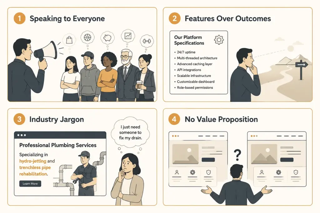
Most confusing homepages share a handful of common messaging problems. While every business is different, these issues show up surprisingly often.

Trying to Speak to Everyone

Many businesses want to attract as many potential customers as possible, so the homepage ends up with messaging broad enough to include everyone. But that broad messaging rarely feels relevant to anyone in particular. When a page tries to speak to everyone, the people who need it most may not feel like it’s meant for them.

Leading With Features Rather Than Outcomes

Businesses naturally focus on what they do, but visitors care more about what changes because of it.

Say you’re looking for workflow automation software and come across two homepages. One says “We provide cloud-based workflow automation software.” The other says “We help teams eliminate repetitive manual work.” Which one gives you a clearer reason to keep reading?

Probably the second, because it speaks to the result rather than the process.

Industry Jargon Gets in the Way

Every industry develops its own language. The problem is that customers don’t always speak it. For example, a plumber who lists “hydro-jetting and trenchless pipe rehabilitation services” knows exactly what that means. But most of their customers are just looking for someone to fix a blocked drain.

When visitors have to stop and work out what a page is trying to say, many won’t keep reading.

No Clear Value Proposition

Many homepages tell people what the business does but never explain why it’s the better choice. A visitor might learn what services are available, but not what makes this business different from the dozens of competitors offering the same thing.

A clear value proposition answers those questions directly and gives people a specific reason to choose you over anyone else. Without it, most prospects will simply move on to a business that has made its value clearer.

What a Clear Homepage Looks Like

A clear homepage doesn’t need clever wording or complicated marketing language. It needs to answer three questions as quickly as possible:

  • What do you do?
  • Who do you help?
  • What result can customers expect?

Visitors shouldn’t have to hunt for those answers. The easier they are to find, the easier it is for people to decide whether they’re in the right place. Here’s how that difference looks in practice:

What Many Homepages Say What Visitors Understand More Easily 
“We provide innovative digital solutions for modern businesses.” “We build websites for small businesses in Connecticut that are easy to find on Google.” 
“Our team of experts is dedicated to delivering excellence.” “We’ve helped over 50 local businesses get online and start attracting new customers.” 
“We offer a range of services to meet your needs.” “Website design, SEO, and ongoing support, all in one place.” 
“Contact us to learn more.” “Get a free quote today, no obligation.” 

The examples on the right aren’t more creative, but they communicate much more clearly. Within seconds, visitors know what the business offers, who it’s for, and why it’s relevant to them. That clarity removes friction, encourages people to keep reading, and makes taking the next step feel much easier.

How to Tell If Your Homepage Has This Problem

How to Tell If Your Homepage Has This Problem

The good news is that homepage clarity is relatively easy to test.

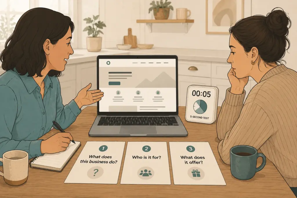
One of the simplest methods is the five-second test. Show your homepage to someone who knows nothing about your business. Let them look at it for five seconds, then close the page. Ask them three questions:

  • What does the business do?
  • Who is it for?
  • What does it offer?

If they struggle to answer any of those, your messaging probably needs work.

Another useful approach is to ask several people to describe your business after reading your homepage. If you get noticeably different answers from each person, that’s a sign your homepage is saying different things to different people.

We’ve used both of these tests while reviewing client homepages, and they consistently reveal the same issue. Business owners know exactly what they do, but first-time visitors often can’t explain it after a quick look. That’s usually where the messaging work begins.

Clarity Wins More Than Creativity

Fixing a confusing homepage doesn’t always require a complete redesign. Often, a clearer headline, simpler language, and a stronger focus on customer outcomes are enough to improve how visitors respond.

The tests covered above are a good place to begin. Use what you learn to refine your messaging and remove anything that makes visitors work harder than they should.

If you’re not sure where your homepage is falling short, Westport Osprey can help. We’ve reviewed homepages for businesses across Westport and Connecticut to uncover the messaging issues that often stand between a website and more inquiries.

Get in touch to see how a clearer homepage can start bringing in more inquiries.

Frequently Asked Questions

Unclear homepage messaging raises common questions about conversions, trust, and user behaviour. Below are answers to some of the most common ones.

Does homepage clarity affect my conversion rate?

Yes. When visitors land on a page and can’t quickly understand what a business offers, many leave without taking action. A clearer homepage reduces that friction and gives visitors a stronger reason to keep exploring, which can improve conversions over time. Even small messaging changes can have a noticeable impact.

Do trust signals really make a difference on a homepage?

They do, especially for visitors who are unfamiliar with your business. Social proof such as customer reviews, trust badges, case studies, and media mentions gives people more confidence before they contact you. Without these signals, even a well-written homepage can feel less trustworthy.

How does homepage messaging affect mobile users?

Mobile visitors often have less patience for unclear messaging because they are viewing content on a smaller screen. Clear headings, concise copy, and easy access to important information help them quickly understand what your business offers and what to do next.

Where else does unclear messaging show up on a business website?

The homepage is often the first interaction visitors have with your business, but unclear messaging can affect other important pages too. Service pages, landing pages, and contact pages all need to explain your offerings clearly. If visitors can’t understand what you provide or what to do next, they may leave before reaching out.

How do I know if my homepage changes are actually working?

Track how visitors interact with your page after making changes. Tools like Google Analytics can show whether conversions improve, how long users spend on the page, and which pages they visit next. Looking at these patterns helps you understand whether your new messaging is making it easier for visitors to take action.

Custom vs Template Website

Custom Web Design vs Pre-Built Templates: Which Fits Your Business

Choosing between a custom and a template website is an important decision. It influences everything from visual design and user experience to overall business performance.

Templates are quick, affordable, and a good starting point. But as your business grows, you start running into walls, including design elements you can’t change and features you can’t add. On the contrary, custom web design offers greater flexibility and scalability, but it typically requires a larger upfront investment and a longer development timeline.

That’s exactly what this article breaks down. By the end, you’ll know which option actually fits where your business is right now, and where it’s headed.

Custom vs. Template Website: What’s the Real Difference?

Custom vs. Template Website: What's the Real Difference?

At the most basic level, a custom versus template website comes down to one thing: control. A template website pulls from a library of pre-made designs that thousands of other businesses are already using.

On the other hand, a custom website is built specifically around your business, your audience, and your goals. Both options can get you online. But what they offer beyond that is pretty different.

Here’s a closer look at what each one actually gives you.

What a Template Website Actually Gives You

The best part about template websites is that you can get a decent-looking site live in just a few hours. Most builders give you attractive templates with drag-and-drop tools that require zero coding knowledge. For small projects, that kind of quick setup is honestly hard to beat.

On top of that, Basic features like contact forms, image galleries, and mobile-friendly layouts come built right in. As a result, Builder features cover the essentials pretty well for simple websites.

The trade-off is that customization options are limited once you outgrow those defaults.

What You Get With a Custom Website

Custom websites are designed around the functionality, customer journey, and growth plans your business requires. Here, web designers create custom designs that reflect exactly who you are. That helps to create a stronger first impression, making visitors more likely to trust your business and remember your brand.

Custom-built websites also support advanced features and functionality you won’t find in a standard builder. You own every line of custom code, with no platform restrictions holding you back. For growing businesses, that kind of control makes it easier to scale.

Can Your Own Website Grow With Your Business?

Can Your Own Website Grow With Your Business?

In fact, 81% of customers prefer companies that offer personalized experiences. That statistic alone shows why businesses are increasingly looking beyond one-size-fits-all website solutions. In that case, Flexibility helps businesses adapt and stay competitive as their needs evolve

The problem is, not every website is built to grow with you. Template platforms work great at the start, but they can quickly hit a ceiling when your needs get more specific. Your own website should work for you at every stage, instead of just the early ones.

Growth often brings new requirements that weren’t part of the plan when your website first launched. You may need advanced booking tools, customer portals, CRM integrations, or other specialized features.

That’s why it’s worth looking beyond the default features.

Customization Options and Builder Features to Know

Most website builder platforms give you enough to get a small business started without spending much. Tools like the GoDaddy website builder and Squarespace offer clean, ready-to-use layouts.

The issue comes when you need more than the standard builder features. Custom development lets you plug in specific tools and workflows that templates won’t be able to support.

With that flexibility comes the opportunity to focus on the features that matter most, saving your business time and cost. After all, not every tool a builder offers is something you’ll actually use.

Advanced Features vs. Drag and Drop: Which Fits Your Needs?

A drag-and-drop editor works well for simple websites and basic landing page setups. But once your needs grow, those tools start showing their limits.

So, complex websites with e-commerce functionality need a proper custom build. Advanced features like multi-currency support and CRM connections aren’t something a drag-and-drop editor can handle well.

Worth Noting: Small businesses planning to scale should think carefully. The right choice now saves a lot of headaches down the road.

E-Commerce, Key Features, and Third-Party Integrations

Template-based e-commerce sites often come with rigid third-party apps and limited integration options. You get what the platform supports, and not much else. For many businesses, that ceiling shows up sooner than expected.

Custom e-commerce websites connect third-party services through tailored API setups that fit your specific needs. Custom sites support advanced security layers, secure payment gateways, and compliance with standards like PCI-DSS. That goes a long way in building real customer trust.

The customer experience on a custom site also tends to be noticeably better. Key features like personalized recommendations and responsive designs all come together in a way that most template sites just can’t match.

E-Commerce, Key Features, and Third-Party Integrations

AI Tools, Custom Domain, and Long-Term Cost Efficiency

Most business owners don’t realize how much they’re spending on platform fees, plug-ins, and workarounds until they sit down and add it all up. A custom build costs more upfront, no question. But the long-term picture looks pretty different.

Here’s a quick comparison to put things in perspective:

FeaturesTemplate WebsiteCustom Website
Monthly feesOngoing platform costsOne-time build cost
AI toolsBasic built-in automationTailored to your workflow
Custom domain nameOften included as an add-onFully owned and controlled
SecurityPlatform-level onlyAdvanced, business-specific
Frequent updatesOften neededBuilt to your specific needs
SEO controlLimitedFull control over every page

Web hosting, security, and cost all work differently with a custom build. But for businesses focused on long-term digital presence and growth, the numbers tend to work out in their favor.

Your Next Step Toward a Website That Actually Works for You

Now that we’ve covered the key differences, features, and costs, the answer comes down to where your business stands today. Template websites are a solid starting point for simple websites and tight budgets. But if you’re serious about growth, a custom build gives you the room to get there.

Local businesses in Westport and across Connecticut are making this shift more and more. A stronger web presence helps you reach potential customers who are already searching for your services. Better yet, a site built around your goals converts those visitors into actual sales.

At Westport Osprey, we build custom websites that work as hard as you do. Our team of web designers knows exactly what businesses in this area need to stand out online.

Reach out today and let’s talk about what the right website can do for you.

Modern website design trends

What Makes a Website Design Feel Modern to Users

Your website has about 50 milliseconds to make a good first impression. That is a tiny part of time, and most of it comes down to how your site looks and feels at a glance. Modern website design trends have changed what visitors expect, and sites that ignore those changes tend to lose people fast.

This article breaks down the visual and operational elements that make a website feel current, with color palettes, typography, including mobile responsiveness, and the latest web design trends shaping user behavior today.

At Westport Osprey, we work with small businesses across Connecticut to build modern websites that load fast, look sharp, and keep visitors engaged.

What Do Users Actually Expect From Modern Web Design?

Modern web design meets expectations by combining fast load speeds, clean layouts, and intuitive navigation that guides visitors without confusion. People do not want to hunt for information. They scan web pages left to right, and expect the most important content to show up exactly where they look.

Good web design follows those user behavior patterns by design. A user-friendly website puts the right content in the right place, making every page feel natural to move through. That is what separates a site people trust.

The Visual Side: Color Palettes, Fonts, and First Impressions

Color palettes and typography are doing most of the attracting work. Before anyone reads a headline or clicks a button, the visual elements on your page have already set the tone. If visitors get those wrong, even great content will not save you.

The Visual Side: Color Palettes, Fonts, and First Impressions

Consistent visual language across every page builds trust and keeps user engagement strong. In fact, poor font sizing or clashing colors push people away faster than a slow load time ever would.

Below, we explain what delivers better results:

How Color Theory Guides the Way Users Feel

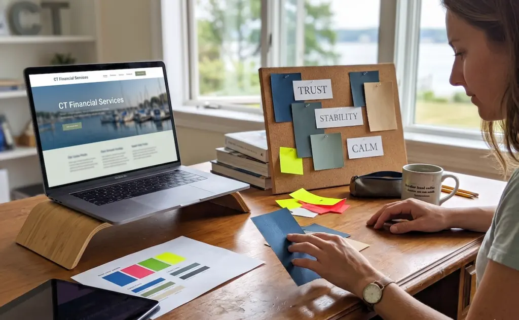
Get color theory right, and your web presence communicates trust, urgency, or calm before a visitor reads a single word. Different hues produce specific emotional responses, and web designers use that to guide their audience toward action.

For instance, blue builds trust, red creates urgency, and green signals safety across global audiences. Choosing the wrong palette for your target audience can undermine credibility.

If you own a financial services page using neon colors appears off immediately. That disconnect is something we see regularly with new clients coming to us from Westport and the surrounding Connecticut area.

Typography and Spacing as Core Design Elements

Color is only half the story. Typography and spacing are just as responsible for a polished page. For instance, tight spacing and small fonts make web pages feel cluttered, which cuts reading time significantly. Good typography uses contrast, hierarchy, and white space to guide the eye naturally down the page.

Font choices also communicate brand personality. A serif looks traditional and established, while a sans-serif reads as clean and current to most people browsing today.

Mobile Responsiveness Is No Longer Optional

Mobile devices now account for over 50% of all global web traffic, according to StatCounter. Most of those people will leave a page that does not display properly on their phone, and they rarely return.

Mobile Responsiveness Is No Longer Optional

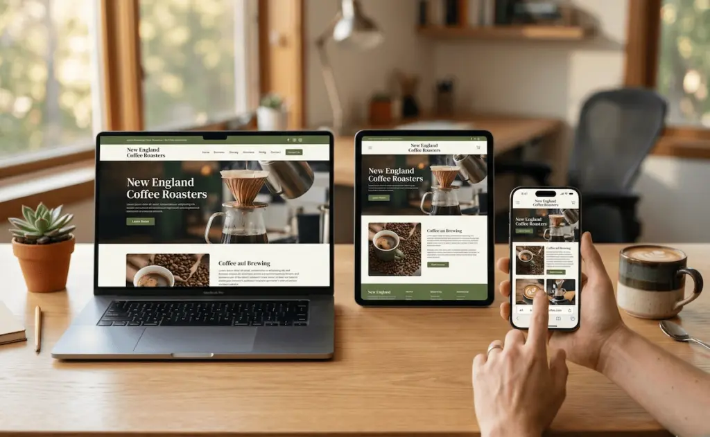
Mobile responsiveness means your layout, buttons, and text adjust automatically across different screen sizes. Search engines like Google rank mobile-friendly pages higher, so poor responsiveness hurts both user experience and search engine rankings directly.

Here is what a responsive website handles without any extra effort on your part:

  • Flexible Layouts: Your web pages reformat automatically to fit any screen, from large desktop monitors to small smartphone displays. This creates a consistent browsing experience that keeps users engaged and reduces bounce rates (no matter how they access your site).
  • Readable Text: No one wants to zoom in just to read. Font sizes adapt to different devices, keeping content clear, comfortable, and easy to scan at a glance.
  • Optimized Images: Well-optimized visuals enhance both speed and user engagement. Images scale perfectly without distortion, helping pages load efficiently while maintaining a sharp, professional appearance on all screen sizes.
  • Clickable Buttons: Easy navigation increases conversions. Buttons and links resize for touch screens, allowing users to navigate without frustration, especially on mobile devices.

A website that handles all four of these well gives your audience a smooth user experience, no matter how they find you.

Dark Mode, Hamburger Menus, and Other Latest Web Design Trends

Staying current with the latest web design trends is one of the fastest ways to keep visitors on your page longer and reduce bounce rates. After all, technological advancements move quickly, and audience expectations follow right behind them.

Today’s visitors notice when a website feels dated. Interactive elements like micro-animations, dynamic content, and personalized experience features have become part of what makes digital experiences feel fresh. Knowing which trends add real value versus which ones distract helps businesses make smarter decisions.

Dark Mode and Its Effect on User Engagement

Dark mode has gone from a novelty to a genuine preference for millions of people worldwide. Apple and Google both introduced system-wide dark mode across their platforms, and web designers followed quickly with matching options on their pages.

The appeal is practical. This setting reduces eye strain and extends screen time, especially for anyone browsing late at night. Not to mention, pages offering a dark theme toggle tend to see longer session durations, which is a positive signal for user engagement and search rankings.

The Hamburger Menu: Handy or Harmful?

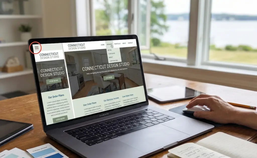
That three-line icon in the corner of your screen has sparked more debate in web design circles than almost anything else. The hamburger menu hides navigation behind those three lines, saving screen space and keeping the home page clean for first-time visitors.

The Hamburger Menu: Handy or Harmful?

On mobile, it works well and allows users to tap through a tucked-away menu naturally. On desktop, though, it reduces discoverability and pushes bounce rates up by burying navigation that your audience expects to see immediately.

Quick Tip: Test navigation visibility against your conversion rate to decide whether a hamburger menu suits your build.

Key Elements That Define Good Web Design

Good web design comes down to a handful of important elements that every modern page should have in place. Take a look at this quick breakdown:

Element

What It Does

Visual Hierarchy

Guides the eye to the most important content first

White Space

Reduces visual clutter and makes pages easier to read

Mobile Responsiveness

Ensures your build works cleanly across all screen sizes

Page Speed

Keeps people on the page and supports search engine rankings

Call to Action

Points visitors toward the next step on every page

Usability

Makes every interaction feel natural and user-friendly

A well-designed website hits all six of these. Skipping usability tests before launch is one of the most common mistakes we see, and it shows up in bounce rates and poor search rankings.

Ready to Give Your Website a Modern Feel?

Modern website design trends move fast. Visitors expect clean layouts, fast load speeds, and design elements that feel current the moment they land on your page. Falling behind means losing people to sites that simply look and work better.

Fortunately, updating your online presence does not require starting from scratch. Small changes to your color palettes, typography, mobile responsiveness, and overall user-friendly structure can make a real difference to your conversion rate and search rankings.

Westport Osprey helps Connecticut businesses build modern web design that works. Reach out today and let us show you exactly what your page needs.

website first impression

How Website Design Affects First Impressions and Trust

Have you ever landed on a website and felt something was off, even before you could explain why? Maybe the colors felt wrong, the layout looked messy, or the site didn’t feel trustworthy. So you left.

That gut reaction happens fast. Research shows that visitors form a first impression of a website in about 50 milliseconds. That’s quicker than a blink. And once that impression is set, it’s hard to shake.

This article breaks down how website design reforms credibility from the moment someone lands on your page, and what you can do about it.

The Psychology Behind a Website’s First Impression

A website’s first impression is formed almost entirely by design, and it happens faster than most people realize. Before a visitor reads your headline or checks your services, their brain has already made a snap judgment. That judgment is based on what they see, rather than what they read.

Studies show that 94% of first impressions are design-related. So if your site looks outdated or cluttered, visitors will question the business behind it, no matter how good your actual offering is. The design is the first handshake, and a weak one sends people straight to your competitor.

What User Research Says About Those First Few Seconds

What if your website is losing visitors before they even read your headline? The process of forming an impression starts the moment a page loads. In fact, research shows users make design-based judgments before a single word is processed.

Eye-tracking user research confirms that visitors scan pages in an F-pattern, focusing on the top-left area first. UX design studies also show that poor load speed and broken layouts are among the fastest ways to destroy a first impression.

As we already mentioned, users decide to stay or leave in under 50 milliseconds, and your site either earns that split-second or loses it.

The Role of UI Design in Building Trust

The Role of UI Design in Building Trust

The best part about clean UI design is that it does the trust-building work before a visitor reads a single word. Good visual design creates what researchers call cognitive ease. And when users feel at ease, they’re far more likely to stick around.

Visual elements like consistent fonts, color schemes, and spacing signal that a business is organized and reliable. Building trust through UI design means creating a site that feels predictable and safe, rather than flashy graphics. When users interact with a well-structured layout, it naturally builds confidence in the brand behind it.

Trust Signals: What Builds Credibility and What Raises Red Flags

Trust signals are the specific design and content elements that tell visitors your site is safe, real, and worth their time. And website credibility lives or dies by them. If your site is missing these, visitors won’t stick around long enough to read your pitch.

Here are the red flags that hurt credibility fast, and what to do instead:

  • No SSL certificate: A site without HTTPS feels risky, and most browsers now flag it as “Not Secure.” That alone kills trust before a visitor reads a single line.
  • Generic stock photos: Real businesses use real images. Overly polished, obviously fake stock photos signal that there’s no genuine team or story behind the business, and users pick up on that fast.
  • Missing contact details: If visitors can’t find a phone number, email, or address, they assume the worst. Legitimate businesses make it easy to get in touch.
  • Outdated fonts and broken links: These signal neglect. If a site is broken, outdated, or neglected, users assume the business behind it is equally disorganized or no longer operational.

Honestly, businesses that display trust signals clearly give visitors every reason to stay. Those who don’t make it very easy to leave.

Social Proof and Professional Design That Work Together

Social Proof and Professional Design That Work Together

When social proof and professional design work together, they give visitors every reason to stay and zero reasons to leave. Customer testimonials with real names and photos help businesses build trust and make potential customers feel more confident about choosing their services.

Positive reviews from platforms like Google or Yelp add another layer of credibility because they come from verified users, not the business itself. And if you’ve worked with established brands, show it. Logos of recognizable clients or features in news outlets signal authority to first-time visitors in a way that words alone never could.

Cohesive branding ties all of this together. After all, a site that looks polished and consistent makes social proof feel credible. That combination is what turns a skeptical visitor into a confident one.

The Information Architecture Red Flags Visitors Notice First

Most visitors won’t tell you why they left your site. But information architecture problems are usually the reason. Confusing navigation and buried contact details are the most common user needs that sites fail to meet.

Information architecture is simply how your site is organized. Think of it as the blueprint behind your navigation, page structure, and content flow. When it’s done well, users interact with your site without even thinking about it. When it’s off, visitors feel lost and leave.

Based on our experience, visitors expect to find pages like About, Services, and Contact within two clicks or less. But broken links and dead ends can quickly derail the user journey. A disorganized site structure makes visitors feel like the business has something to hide, and that feeling is hard to recover from.

The Design Process That Turns First Impressions Into Real Trust

The Design Process That Turns First Impressions Into Real Trust

Now that we’ve covered what trust signals look like, let’s talk about the design process that actually puts them in place. It goes a lot deeper than picking colors and fonts.

UX designers don’t just make sites look good. They study the target audience, map out user journeys, and identify pain points before a single design idea hits the screen. That research structures every decision, from layout to color to copy.

Usability testing and contextual inquiry are also part of this process, which makes sure the final product meets user expectations. For Westport businesses, good ux design aligned with your specific business goals will always outperform a site built on guesswork.

Now’s the Time to Make Your Website Work for You

Fortunately, fixing your website’s first impression doesn’t require a complete overhaul. Small, deliberate changes to your design, trust signals, and information architecture can make a real difference to your digital presence.

Here’s where to start:

  • Review your site for red flags like missing contact details and broken links
  • Add customer testimonials and real team photos to build social proof
  • Make sure your branding is cohesive across all pages
  • Check that your site feels equally strong on different platforms and screen sizes

Westport Osprey helps local Westport businesses build websites that earn trust from the very first click. If your site isn’t building trust, it’s losing business. Contact us to fix that.

Local Business Web Design built around goals

Why Local Businesses Need Websites Built Around Their Goals

Let’s be honest, a website without a real goal won’t bring in calls, fill out forms, or push people toward a purchase. Most small businesses figure this out after the site goes live and the phone stays quiet (when it’s too late!).

That delay costs time, money, and customers you won’t get back. But when your business goals drive the design, every page gives visitors a clear next step, and your marketing connects naturally.

This article covers why goal-based web design produces better results for local businesses and what it looks like when it’s done right. Read through, and see where your current site is falling short.

The Local Business Web Design Problem

A good-looking Website doesn't mean a well-performing site

Most local business web design prioritizes how a site looks over what it needs to perform well.

A site without a strategy is like opening a store with no products on the shelves. People walk in, look around, and leave without buying anything. Search engines react the same way.

These are the issues that hold most sites back:

  • Appearance Over Objectives: Web design projects usually start with colors, fonts, and layouts, and business objectives never make it onto the list. A polished site with no strategic direction gives visitors nothing to act on.
  • Search Engine Visibility: Search engines rank sites based on structure, load speed, and core web vitals, and none of those come standard with a visually focused build. Without those foundations, your site stays invisible to the people searching for it.

A website that looks fine but produces no results isn’t a cheap mistake. The longer it runs without a strategy, the more revenue you lose.

What Goal-Based Website Design Really Looks Like

The whole process starts with one question: “What does your business need this site to accomplish?

That answer drives the design decisions, the layout choices, and the calls to action across the entire site. In other words, a website built around clear goals works like your best sales department.

This is what that looks like when it’s done right:

The Goal Comes Before the Design

Before anything gets designed, goal-based web design identifies what the business needs the site to accomplish.

Take phone calls as an example. A phone call goal puts your contact details above the fold, with the entire site pushing visitors toward picking up the phone. A lead generation goal, in that case, centers on the opt-in form and the offer.

The goal determines the build, and honestly, most sites skip that conversation entirely.

Every Page Gets a Job

And that goal-driven approach carries through the entire site. The homepage builds trust, the services page answers objections, and the contact page makes it easy to reach out, so every visitor always has a clear next step in front of them.

We’ve seen businesses double their inquiry rate simply by giving each page a defined role and sticking to it.

Custom Beats Generic Every Time

A website builder gets a site live fast, which isn’t the same as functional. A good web design team builds custom websites around your specific business objectives, your target audience, and your brand’s message.

Unlike a drag-and-drop template, a custom site is built around your specific needs, and the results reflect that directly.

How Your Business Website Shows Up on Search Engines

Checking local speed and web vitals

In reality, search engines rank on the following criteria: site structure, load speed, and core web vitals. A site weak in any of those areas hands potential customers directly to competitors whose sites load better and rank higher.

Proven strategies like goal-setting before design and solid technical implementation make a measurable difference, too. For a quick reality check, you can see how your site scores with PageSpeed Insights, and the gaps are usually clear.

In our experience, sites built around business goals consistently produce better search visibility and more inquiries. And Google’s own research confirms that page experience directly affects where your site lands in the results.

Lead Generation, Landing Pages, and Getting People to Act

Most landing pages get visited and forgotten. The heading, the images, and the layout might all look right, but if nobody built the page around a specific lead generation goal, visitors have no real reason to do anything.

The goal comes first, and everything else follows from it:


Business Goal


Page Element It Drives


Book a consultation


Prominent contact form above the fold


Sell a product


Clear pricing with a single call to action


Build an email list


Lead magnet with opt-in form


Drive phone calls


Click-to-call button on mobile

And honestly, poor page structure kills conversions before visitors even get a chance to act. Most landing pages lose people within the first few seconds because the page never makes it clear what to do next.

So naturally, a digital strategy that connects landing pages to specific business objectives produces leads you can track and measure.

Conversion Optimization and What a Goal-Driven Site Delivers

Planning the placement of the website content

Conversion optimization gives every page a specific job: move the visitor toward a decision.

Simply put, the placement of your call to action, the white space around it, and the clarity of your next step all play a direct role in your conversion rates. That applies to all the devices your visitors use.

In fact, a large portion of your traffic arrives on mobile devices, and a site that isn’t mobile-friendly sends those visitors away before they reach your call to action.

What’s more, Google’s own data confirms that mobile-friendly sites rank higher and retain visitors longer, which is why responsive design is a baseline requirement (Google always ranks your mobile site first).

Based on what we’ve seen, a goal-driven site with strong mobile performance consistently outperforms a visually polished one without either.

A Better Website Starts With a Better Goal

Every section of this article points to the same conclusion. A small business website that isn’t built around clear goals costs you leads, visibility, and revenue every single day it stays that way. Most businesses realize this way too late.

So with that in mind, goal-based web design addresses each of those gaps directly. Site structure gets your site found, landing pages get visitors to act, and conversion optimization makes sure every page earns its place.

At Westport Osprey Website Design, we help many people build their sites around what their business truly needs. Reach out, and our team will take you through every step of the process. Your next website should work harder than your last one.

SEO Web Design Integration

How SEO and Web Design Work Better Together

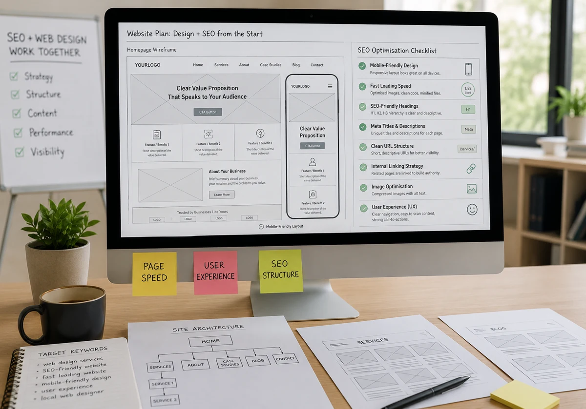
SEO and Web Design work better together because search engines drive traffic to your website, while great design keeps users engaged and converts them into customers. Most businesses treat them like two separate projects. But one team builds the site, another tries to fix it for search engines after launch.

A well-built site does both jobs at once. It loads fast, guides visitors where they need to go, and gives Google exactly what it needs to rank your pages with confidence.

At Westport Osprey, SEO web design integration is baked into every project from the first conversation. After all, a site that looks great but stays buried in search results won’t work for your business.

SEO Web Design Integration: Why Your Site Structure Signifies More Than You Think

SEO Web Design Integration: Why Your Site Structure Signifies More Than You Think

A good website architecture does two things at once. It helps users move through your site naturally, and it gives search engines a clear map of what your site is about. When both work together, your chances of showing up in search results go way up.

Your website’s structure is the invisible backbone that either guides your customers to a sale or drives them straight to a competitor. Before you write a single line of code or copy, remember: search engines can’t rank what they can’t find.

How Google Crawls Your Site and Why It Counts Target

Google doesn’t read your site the way a person does. Instead, it sends out search engine crawlers, basically small automated bots, that follow links thoroughly and understand what’s on your site. If a page has no internal links pointing to it from other pages, those crawlers may never find it.

Here’s what affects how well Google crawls your website’s pages:

  • Crawlable Links: Every important page needs at least one link pointing to it from somewhere else on your site. Crawlers follow links rather than guessing.
  • XML Sitemap: A sitemap acts like a directory. It tells Google which new pages exist and where to find them, especially useful as your site grows.
  • Blocked Resources: Sometimes, pages get accidentally blocked from crawlers through robots.txt settings. When that happens, Google can’t index them even if the content is good.

Ultimately, ensuring your site is easily navigable is the foundation of good SEO. If Google’s crawlers can’t efficiently find, read, and index your pages, even the most exceptional content will remain invisible to your target audience.

Information Architecture: Does Your Layout Make Sense to Search Engines?

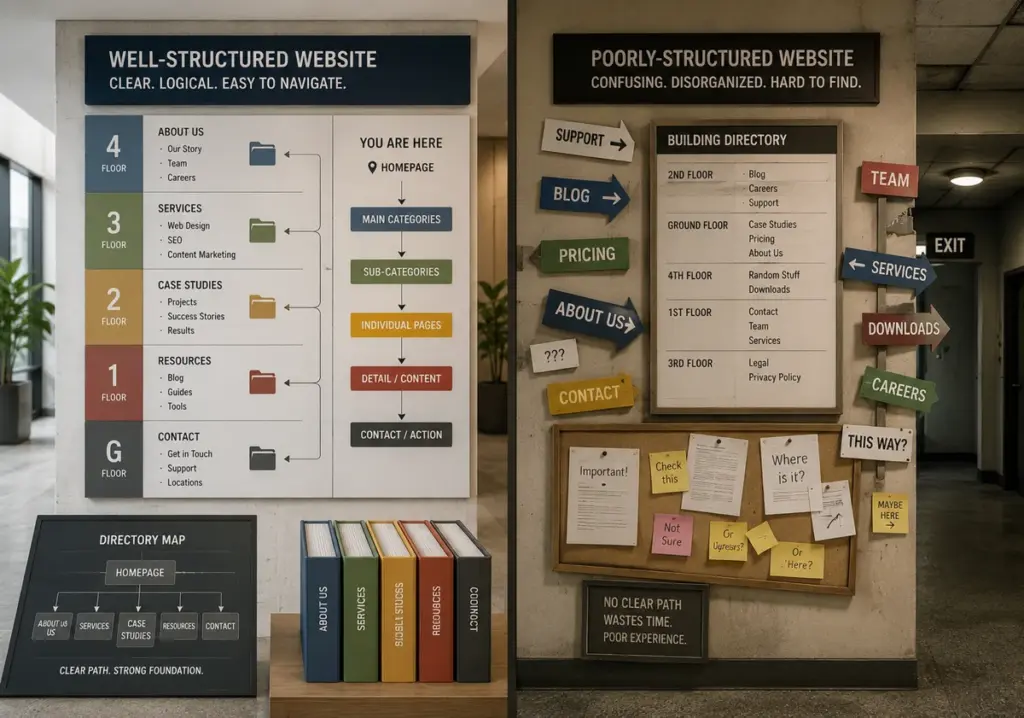
A good structure follows a simple pyramid: homepage at the top, main categories below it, and individual pages underneath those. That logical flow helps search engines understand what your site is about. Let’s see the comparison,

Well-Structured SitePoorly Structured Site
Clear main categories from the homepageRandom pages linked from the homepage
Individual pages under relevant categoriesBlog posts are buried under unrelated sections
Site’s menu reflects page hierarchyMenu items don’t match the site structure

Duplicate Content and Category Pages: A Common Mistake Target

When several pages cover the same topic, Google struggles to pick which one to rank. So instead of one strong page performing well, you get two or three weak ones splitting the same potential.

Category pages are one of the biggest places where duplicate content shows up. For better utilization, use canonical tags to point Google to the primary page, and make sure each page on your site serves a clear, separate purpose.

Technical SEO Basics: Best Practices Built Into Your Web Design

Technical SEO Basics: Best Practices Built Into Your Web Design

Most people think technical SEO is something you sort out after a site launches. But that’s where things get expensive. On the contrary, page speed, mobile responsiveness, and HTTPS are all design decisions that affect your site’s performance and your ranking from day one.

By baking these core technical elements straight into your initial web design, you set a flawless foundation for search engines from the jump. This approach prevents costly redesigns later and ensures your site is primed to rank the moment it goes live.

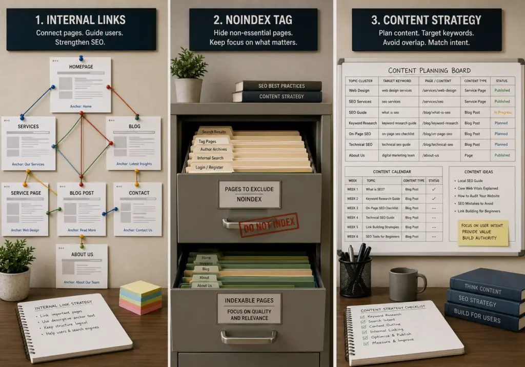
Internal Links, the Noindex Tag, and a Content Strategy That Pulls More Traffic

Without links pointing from other pages to your important pages, even your best content can go unnoticed by search engine crawlers.

A few things worth getting right from the start:

  • Internal Links: Use descriptive anchor text and link to important pages from other pages across your site regularly.
  • Noindex Tag: It prevents Google from indexing low-value pages like thank-you pages or admin URLs, keeping your index clean.
  • Content Strategy: Keyword research helps you write content and assign specific topics to individual pages, so no two pages compete for the same search.

Mastering these three elements ensures your site architecture is airtight and easy for search engines to navigate. With the help of these, you maximize your visibility and stop your own pages from competing against each other.

SEO Web Design Integration: Getting the Technical Side Right

This is where SEO web design integration really shows its value. And, our investigation demonstrated that sites built with these elements in place rank faster and hold their positions longer. Here is what every well-structured site needs:

  • URL Structure: Keep URLs short, descriptive, and consistent across all product pages and category pages.
  • Multiple Languages: If your site serves users in different languages, create separate pages for each language rather than mixing content on one page. In the globalization era, it’s a much-needed feature.
  • Site Grows: As your site grows, certain pages will need revisiting. An SEO expert or design services team should audit regularly to protect your website’s SEO and organic traffic.
  • Structured Data: Add structured data to help Google understand your content better, especially for e-commerce site pages and product categories.

Ready to Stop Losing Traffic to a Site That Wasn’t Built for Search?

SEO and web design aren’t two separate projects. When your site architecture, internal links, structured data, and content strategy all work together, your pages show up in front of the right people in search results.

At Westport Osprey, we handle both sides. Be it homepage or technical SEO basics, every site we build is designed to rank and convert.

Reach out to the Westport Osprey team today. We’ll look at your current site, spot what’s holding it back, and build something that works for both Google and the people landing on your pages. That’s the kind of site that actually grows your business.

Custom Web Design Benefits

How Custom Web Design Supports Long-Term Business Growth

Stuck with a website that can’t keep up as your small business grows? Let’s be real here. Most companies start with basic sites that work fine at first, but things get messy when you need to add features or scale up.

This guide shows how custom web design benefits support growth as your company changes and expands. You’ll learn why tailored sites adapt better than templates when your business goals shift or grow.

Connecticut small businesses have used scalable web design to build their online presence without starting over every few years. If you want similar results, keep reading.

What Are the Benefits of Custom Web Design for Growing Companies?

Custom web design benefits give you a website that adapts as your company grows, rather than holding it back. Here’s what’s interesting. Most template-based websites work fine at first, but they start causing problems when your business needs change. A custom website gives you room to grow without hitting walls every few months.

Let’s talk about what actually makes custom sites different.

Room to grow when you need it

Room to grow when you need it

When your business expands, you can add new features without rebuilding everything. Need a booking system next month? No problem. Want to add a customer portal later? That works too. Template-based website platforms make you squeeze into their preset layouts (it’s more common than you think). Custom web design lets you build what your target audience actually needs instead of settling for what a template allows.

Your brand shows up everywhere

The user interface matches your actual brand identity, not some generic theme. High-quality images, custom layouts, and specific color choices all work together to show website visitors who you really are. Plus, the site reflects how your customers think and behave instead of forcing them through navigation that made sense to a template designer somewhere.

Speed matters more than you realize

Template-based sites come loaded with code for features you’ll never touch. All that extra weight slows your site down. A custom website only carries what you actually use, which means faster load times. Search engines notice this and rank faster sites higher. So your web design becomes something that actually brings in business instead of just existing online.

The difference adds up over time when you’re trying to stand out from competitors using the same tired templates.

Why Search Engines Favor Custom Websites Over Templates

Over half of mobile users leave a site if it takes more than three seconds to load. That’s a huge chunk of potential customers gone before they even see what you offer. Search engines notice this behavior and adjust search engine rankings based on website performance.

Think about it this way. When you build a custom website, you eliminate bloated template code that slows everything down. Templates carry features for image sliders and page builders that most businesses never touch. All that extra weight creates slow loading times (and the damage adds up fast) when search engines decide where you rank in search results.

Custom web design gives you control over technical elements that matter for search engine optimization. You can structure URLs properly, add schema markup, and optimize performance from scratch. Mobile devices get layouts built specifically for mobile phones instead of generic responsive templates that just shrink desktop designs.

Search engines also penalize duplicate content. Thousands of websites use identical templates with similar structures. A custom site avoids this completely by creating unique layouts and code. When you handle technical issues right from the start, organic traffic increases because search engines hit the nail on the head, recognizing quality sites.

How Custom Website Development Adapts to Your Business Goals

The best part about custom website development is that you’re never stuck with features you’ve outgrown. From what we’ve seen across dozens of Connecticut projects, businesses hit a point where their site either grows with them or holds them back. Building a professional website gives you control instead of leaving it up to whatever your template allows.

Flexible Features That Scale With Your Online Presence

Better Control Over User Experience and Conversion Rates

When your business goals shift, you can add new product lines or booking systems without switching platforms. Custom website development means integrations work smoothly with the tools you already use. Think CRM software, email marketing platforms, and analytics dashboards.

Third-party tools connect without creating conflicts or breaking your site. Your online presence grows alongside your team and customer base. When push comes to shove, and you need changes fast, custom web design delivers. Future growth doesn’t mean starting over every few years.

Better Control Over User Experience and Conversion Rates

This is where most people go wrong with template sites. When you design forms and checkout flows based on how your actual customers behave, conversion rates improve naturally. You can test different layouts and track what works without plugin conflicts slowing you down.

Want to adjust page elements to reduce friction? Done. Need to guide potential customers toward specific actions? Easy. Custom website development gives you that level of control over the user experience.

Custom Website Solutions for E-Commerce Growth

E-commerce sites need checkout experiences that match your brand and reduce cart abandonment. Template options force generic payment flows that confuse customers. Custom sites let you build product pages with filters, comparison tools, and recommendations based on real customer data.

As sales volume increases, your site handles inventory management without crashing. Website performance stays consistent even during busy seasons, keeping your online presence strong when it matters most.

Custom Design Solves Pain Points That Templates Can’t Fix

Templates create more problems than they solve when your business needs start getting specific. And here’s the thing. Most companies don’t realize their template-based website is causing pain points until they’ve lost customers. Let’s look at what custom web design actually fixes.

  • Rigid layouts force bad compromises: Template-based platforms make you squeeze content into preset structures. When you need custom forms or specific checkout flows, templates force you into cutting corners. A custom site builds exactly what works without sacrificing user experience.
  • Generic features ignore your requirements: You can address compliance rules, accessibility standards, and specialized functionality that template-based website builders don’t offer. Healthcare needs HIPAA compliance. Legal firms need secure portals. Templates treat every business the same, creating a poor user experience.
  • Confusing navigation kills engagement: In our experience with Westport businesses, bad navigation hurts average time on site more than anything else. Custom web design organizes content around how your customers actually search. A strategic redesign creates intuitive paths based on real behavior.
  • Mobile layouts disappoint users: Template-based websites just shrink desktop designs for mobile phones. Custom development optimizes for actual device usage with thumb-friendly buttons and properly sized images. Getting your current site rebuilt with mobile-first thinking changes how people interact with your brand.
Custom Design Solves Pain Points That Templates Can't Fix

When a web designer and web developer collaborate on a redesign strategy, everyone gets on the same page about solving real pain points.

Does Custom Web Design Really Improve Average Time on Site?

Ever land on a website and leave within seconds because nothing made sense? (We’ve all been there). You might be thinking design doesn’t affect how long website visitors stick around, but the data says otherwise.

Template SitesCustom Web Design
Generic navigation confuses visitorsTailored user experience guides the customer journey naturally
Standard layouts ignore user behaviorInteractive elements and visual elements are placed based on research
One-size-fits-all structureSeamless user experience built around actual needs
Higher bounce ratesWebsite visitors stay on site longer

A well-designed website guides people naturally instead of making them hunt around. When visual elements work together to stay visually appealing without cramming everything in, average time on site improves. Custom sites balance information with breathing room and put content where visitors expect it.

Website redesign clears out technical problems causing quick exits. Faster pages create better first impressions. Simple navigation cuts frustration. When you nail the user experience through web design, conversion rates climb because people stick around long enough to increase conversions.

Ready to Build a Custom Website That Grows With You?

Custom web design benefits add up over time as your business changes and market demands shift. Bottom line? Investing in custom website development now saves money on workarounds, migrations, and lost opportunities later.

Template sites might seem cheaper upfront, but they cost small businesses more when growth stalls. A strong online presence built around your actual business goals gives you room to expand without constant rebuilds.

Westport Osprey Website Design creates custom websites for Connecticut small businesses ready to scale smartly. When you’re planning for future growth instead of quick fixes, contact us today to discuss building a site that actually supports your vision.

Website Expectations for 2026

The New Client Expectation Curve: What Customers Want From Websites in 2026

Customers in 2026 expect websites to load instantly and personalize their experience in real time. They also want your site to work flawlessly on mobile and have built-in accessibility features.

Our team at Westport Osprey has been building sites in Connecticut for years now. We’ve watched user needs evolve from basic contact forms to AI-powered personalization, and we know what makes a site easy to use and able to convert rather than frustrate people.

In this article, we’ll discuss what customers expect in 2026 and how we got here. You’ll also learn how to identify real user needs and what happens when you ignore those needs.

Ready? Let’s begin.

What Do Customers Expect From Websites in 2026?

Customers’ expectations from your site include fast loading times, simple personalization based on behavior, and a smooth mobile experience. They’re the baseline for staying competitive in 2026.

What Do Customers Expect From Websites in 2026?

Here’s a detailed list of what customers want from your webpage in 2026:

  • Instant Personalization: Your site should adapt content and layout based on how you analyze user data from how someone actually uses it. For example, if a visitor browsed pricing pages last week, those items should move to the top this time. Plus, your headlines should change naturally to reflect what they showed interest in.
  • Three-Second Load Times: According to BrowserStack, slow sites lose 40% of visitors when pages take longer than three seconds to load. It’s because mobile users are less likely to wait around, regardless of being on 5G or public WiFi.
  • Built-In Accessibility: Visitors now expect websites to work smoothly with screen readers and keyboard navigation, since accessibility is part of basic usability. So, features like high contrast and clear alt text improve the experience for everyone, not just people with disabilities.
  • AI-Powered Self-Service: The best thing about AI-powered self-services like chatbots is that they answer questions at 2 AM without human involvement. There are also other AI tools like Drift and Intercom that can qualify leads and book meetings while you sleep.
  • Transparent Privacy Controls: Plain language is important to users because they’d like to know exactly what data you collect instead of seeing corporate speak about “improving experiences.” Also, you should offer easy opt-out options, which build trust by giving people control.
  • Mobile-First Performance: As per Capital Counselor, 62% of global traffic comes from mobile devices nowadays. That’s why your sites must work perfectly on phones and tablets. Mobile performance also directly affects your search rankings and conversion rates.

Understanding these trends gives product managers a clear understanding of what to prioritize in the right features.

How Did We Get Here?

We got here through three distinct phases: the 2015-2020 static website era, when sites were digital brochures, the 2020-2024 mobile revolution driven by the pandemic, and the 2025 AI-driven personalization explosion.

Each shift raised the bar for what customers consider acceptable, which is why what felt cutting-edge five years ago now feels outdated.

We’ll now take a closer look at these changes.

The 2015-2020 Static Website Era

Remember when having any website at all made you look professional? Back then, websites were digital brochures with basic contact forms. You’d list your services, add some photos, and call it done. Users expected information, but not much interaction or personalization.

During that era, desktop design came first, and mobile optimization was simply an afterthought. For this reason, designers built sites for big screens, then maybe squeezed everything down for phones if there was any budget left (that mindset wouldn’t survive now).

The 2020-2024 Mobile Revolution

The COVID pandemic in early 2020 forced everyone online. Suddenly, businesses that already prioritized mobile performance had a massive competitive advantage. Restaurants needed online ordering, while doctors offered telehealth services. Within months, your website became your storefront.

That is also when mobile traffic overtook desktop, and it made responsive design necessary. By 2021, over half of all web traffic came from phones. So users started expecting app-like experiences from regular websites with smooth animations and instant responses.

How Do You Actually Identify User Needs?

Why Expectations Jumped in 2025

AI tools showed users what personalization could actually deliver. For instance, ChatGPT launched in late 2022, and within a year, millions experienced truly adaptive interfaces. Once users saw what technology could do, they expected every website to be somewhat intelligent.

What’s more, the European Accessibility Act (EAA) made accessibility legally required starting mid-2025. It created a global snowball effect as businesses everywhere upgraded their sites.

The comparison table below will give you a clearer idea of the changes in the website expectation curve:

EraWhat Users ExpectedWhat Technology EnabledBusiness Impact
2015-2020Basic information, contact forms, decent desktop experienceResponsive frameworks, basic CMS platformsWebsite = digital business card
2020-2024Mobile-first design, fast loading, e-commerce capabilityCloud hosting, progressive web apps, and advanced frameworksWebsite = primary sales channel
2025-2026AI personalization, sub-3-second loads, accessibility, self-service toolsAI assistants, edge computing, automation platformsWebsite = intelligent business hub

How Do You Actually Identify User Needs?

You can identify user needs by running surveys and interviews to gather user feedback. You should also focus on user observation with the help of analytics tools and prioritize features based on real impact.

Follow the strategies below to identify user needs through user research:

  • Surveys and Interviews: Surveys let you gather data from hundreds of users in a few hours. However, interviews reveal the “why” behind the numbers. You just have to ask what users need to accomplish instead of what features they think they want.
  • Focus Groups: Watching users react to mockups in real time can save you thousands in wasted development. More importantly, group discussions often surface problems that individual interviews miss because people build on each other’s frustrations and ideas.
  • Analytics and Behavior Tracking: Heatmaps show where users actually click, which you’ll find is often completely different from where you assumed. And session recordings are even better because you’ll spot friction like broken forms or confusing navigation that analytics alone won’t detect.
  • User Personas and Empathy Maps: If you design for a generic user, you risk creating something that doesn’t truly help anyone. That’s why empathy maps are useful in user centered design because they capture users’ thoughts and struggles. They also help you understand actual pain points rather than relying on assumptions.
  • User Need Statements: These statements help teams stay focused on real problems, so they don’t add features just for the sake of it. In fact, a clear problem statement explains what a user needs to accomplish and keeps the team aligned on solving the right issue.
  • Feature Prioritization: The truth is, you can’t address every user need at once. So we recommend focusing on the biggest pain points that affect the most people. Once you balance what users require with clear business objectives and a clear user story, you create something that can grow and last.

These techniques support an iterative design process that evolves as user needs change over time.

What Happens When You Ignore These Expectations?

When you ignore expectations and fail to address user needs, visitors leave quickly, engagement drops, and many users go to your competitors instead. Not only that, but poor experience signals can also hurt your visibility in search engines and reduce revenue.

Let’s get into more detail about these huge impacts.

Visitors Leave in Seconds

According to the World Health Organization (WHO), on its page “Disability,” around 1.3 billion people experience disability today. That’s roughly 16% of the global population, which means many potential users could be affected if a site isn’t accessible. And when that happens, users leave your site instantly.

But that’s not all. Generic experiences push different user segments toward competitors because the site doesn’t feel personal. If every visitor sees the same homepage regardless of their history, it fails to connect with the target audience and becomes easy to forget.

What Happens When You Ignore These Expectations?

Search Rankings Drop

Did you know that Google uses page speed as a ranking factor in search results? Google confirmed it through the Page Experience and Core Web Vitals updates. It means slow sites can lose visibility, especially when competing with faster pages that have similar content quality.

The same goes for accessibility. Inaccessible sites rank lower because search engines pick up on metrics like engagement rates. So when visitors land on your site and leave right away, it signals that the page didn’t meet their expectations.

Over time, search engines use this kind of behavior as a sign that the page may not be a good match for the query.

Pro tip: Improve readability and content structure, since a clear hierarchy helps both users and search engines interpret relevance faster.

Your Next Step for Better User Experience

What users expect from websites keeps increasing, but most sites aren’t meeting those expectations. That’s why businesses that don’t improve accordingly lose both visitors and revenue.

But you don’t need to rebuild your entire site overnight to meet the requirements. Start with the basics like testing your mobile load speed, running a simple user survey, and watching how people go through your site. Those three actions alone will reveal problems you didn’t know existed.

And if you want experts to handle it for you, contact our team for a free website audit. At Westport Osprey Website Design, we help businesses with creating sites that actually meet user needs. Let’s connect and build something your customers will actually use.

Trust signals on websites

The Hidden Design Choices That Make Users Trust a Website Instantly

The hidden design choices that make users trust a website instantly start with clean layouts and visible contact information. When visitors see customer testimonials, confidence starts to build, and security indicators that appear before they scroll down seal the deal. These trust signals build UX trust before customers read anything.

Most business owners in Westport panic when they realize that, despite investing in their website, visitors bounce within seconds. Believe it or not, this is because they can’t find your phone number, or something feels off.

Don’t worry, we have got your back. In this article, you’ll learn how social proof works, why security badges help, and which mistakes to avoid. By the end, you’ll see your anticipated results.

Let’s dive in.

What Makes a Website Feel Trustworthy at First Glance?

Websites appear trustworthy when they show professional design, contact details, and security indicators. Bear in mind that users judge your business within three seconds. Research from the Nielsen Norman Group confirms that design quality influences how users trust any site.

The following three elements build instant credibility:

Professional Visual Design

Clean layouts signal attention to detail. When users see a polished design, they associate your brand with professionalism. For example, white space makes information easier to trust, and high-quality images show real investment.

Clear Contact Information

Phone numbers prove you’re a real business. Multiple contact methods reduce anxiety about reaching you. Plus, Westport addresses create familiarity for Connecticut visitors.

Security Indicators Above the Fold

HTTPS padlock icons reassure users immediately. Alongside that, trust signals from Norton catch attention and validate credibility while “Secure Checkout” language reduces hesitation.

These visual cues work together, but social proof takes trust to another level.

Customer Feedback: Why Reviews Build Instant Trust

Customer reviews indicating happy clients

Reviews build instant trust because they come from real customers. The truth is, people trust other buyers more than your sales copy. When visitors see authentic feedback from previous users, it validates your claims and makes their decision to buy easier.

These make customer feedback work.

Verified Review Platforms

Trustpilot or Google reviews carry more weight than testimonials on your own site because visitors know you can’t manipulate them. Also, star ratings let visitors assess your reputation right away. Third-party verification shows you’re confident about your product quality and brand legitimacy.

Real Photos and Full Names

Testimonials with headshots feel authentic compared to anonymous quotes. You can’t put a face to the name without real photos, and that personal connection changes how users view your credibility. LinkedIn profiles add another layer of proof that users expect.

Specific Details Over Generic Praise

Reviews mentioning exact features prove experience with your service. Based on our firsthand experience, “great service” doesn’t convince anyone, but “response time under 2 hours” does because it’s specific. Detailed feedback helps prospects understand what they’ll get.

Reviews build credibility through social proof, but certain trust signals work even faster to establish trust.

Design Elements That Establish Credibility

Security badges, customer testimonials, client logos, and case studies establish credibility instantly. These trust signals prove you’re legitimate to visitors the moment they land on your site.

Case studies with measurable results go even further by showing proof of your expertise and giving prospects confidence in your ability to deliver. When you add professional certifications and industry awards, you validate your knowledge while separating yourself from competitors.

Compliance badges reassure users about the sensitive information they’re sharing. Money-back guarantees work the same way but for a different fear: the financial risk that stops people from buying.

Listen, a few trust signals placed strategically work way better than dozens scattered randomly across your site.

Why Do Hidden Fees Kill Conversions?

Unhappy customers who found out  about hidden fees

Hidden fees kill conversions because they break trust at checkout. Research from the Baymard Institute estimated 70% of carts get abandoned, and surprise charges are the top reason why. These are some solutions we suggest:

Transparent Pricing on Product Pages

Display full costs upfront to prevent cart abandonment later. When you break down pricing like base price, shipping, and taxes, customers appreciate the honesty and can plan their budget accordingly. Honest pricing builds trust, even if some visitors leave because of higher costs.

Clear Breakdown Before Checkout

Itemized costs let users verify charges before entering payment details (and yes, we’ve all rage-clicked that X button when fees suddenly appeared). This transparency means fewer angry emails and chargebacks after purchase, which protects your business reputation and turns first-time buyers into repeat, satisfied customers.

With transparent pricing established, let’s touch down on security indicators to take that confidence even further.

How Do Security Badges Affect Conversion Rates?

Security badges are the fastest way to calm visitor anxiety about entering credit card information on your site. You might be wondering where to place them for maximum impact.

Our tests revealed that Norton Secured or McAfee badges can boost conversions by 15-30% near payment forms. These trust signals validate your worth:

  • SSL Certificates: Security seals near payment forms reduce anxiety about data theft and sensitive information
  • Payment Logos: PayPal, Stripe, and Apple Pay signal trusted payment processing and familiar checkout experiences users already know
  • Security Badges: Norton Secured or McAfee badges validate credibility the second visitors land on your site, especially when they’re about to hand over credit card details.
  • Strategic Placement: Security indicators work best near form fields where users enter sensitive data. Why? Well, that’s exactly when doubt creeps in.

Security indicators handle the technical side of trust, but there’s a psychological layer most designers overlook completely.

Mental Models: Matching User Expectations to Build Trust

Mental models are patterns users expect based on browsing similar sites. When your site follows familiar layouts and menu placement, users trust that you understand their needs. Break these patterns? The logo doesn’t link home? Users get confused and leave.

Product pages need standard elements like price, reviews, and add-to-cart buttons because that’s what users hunt for first. Experimental layouts make people work too hard, which frustrates them. Match their expectations, and they’ll explore comfortably.

Following these mental models helps, but some design choices actively push customers away.

Common Mistakes That Break User Trust

Website Design Red Flags

Stock photos that look fake, vague About Us pages, and poor mobile experiences destroy user trust faster than anything else. These common mistakes make visitors leave before they even consider buying. Let’s talk about them in detail:

Stock Photos That Look Fake

Generic business people from stock sites signal laziness to visitors (those same faces pop up on every third website they browse). Real customer images build connections. Besides, overused stock images hurt credibility because visitors recognize them from other sites.

Vague About Us Pages

Generic mission statements without real names make visitors wonder who they’re doing business with. Stop beating around the bush. Instead, share specific founder stories, team backgrounds, or Westport office details that create the personal connection users expect from legitimate businesses.

Poor Mobile Experience

Websites that don’t work smoothly on phones frustrate more than half of your traffic. What does that mean for you? Well, tiny text, broken layouts, or slow loading signal outdated technology and careless business practices. Mobile optimization shows you understand modern user behavior.

These mistakes destroy the trust signals you worked hard to build throughout your site.

Start Building Trust Today

Users abandon websites every day because trust signals are missing. Your business loses potential customers not because your service lacks quality, but because visitors can’t verify your credibility fast enough. They click away to a competitor who got the details right.

That’s exactly why we covered the design elements that establish credibility instantly. Security badges, customer testimonials, transparent pricing, and real photos all influence user trust in ways that drive conversions when done right.

Now it’s time to put this into action. Our team at Westport Osprey will take you through every design choice you need to convert skeptical visitors into loyal customers. Your next visitor could be your next sale.