
What Makes a Website Design Feel Modern to Users
Your website has about 50 milliseconds to make a good first impression. That is a tiny part of time, and most of it comes down to how your site looks and feels at a glance. Modern website design trends have changed what visitors expect, and sites that ignore those changes tend to lose people fast.
This article breaks down the visual and operational elements that make a website feel current, with color palettes, typography, including mobile responsiveness, and the latest web design trends shaping user behavior today.
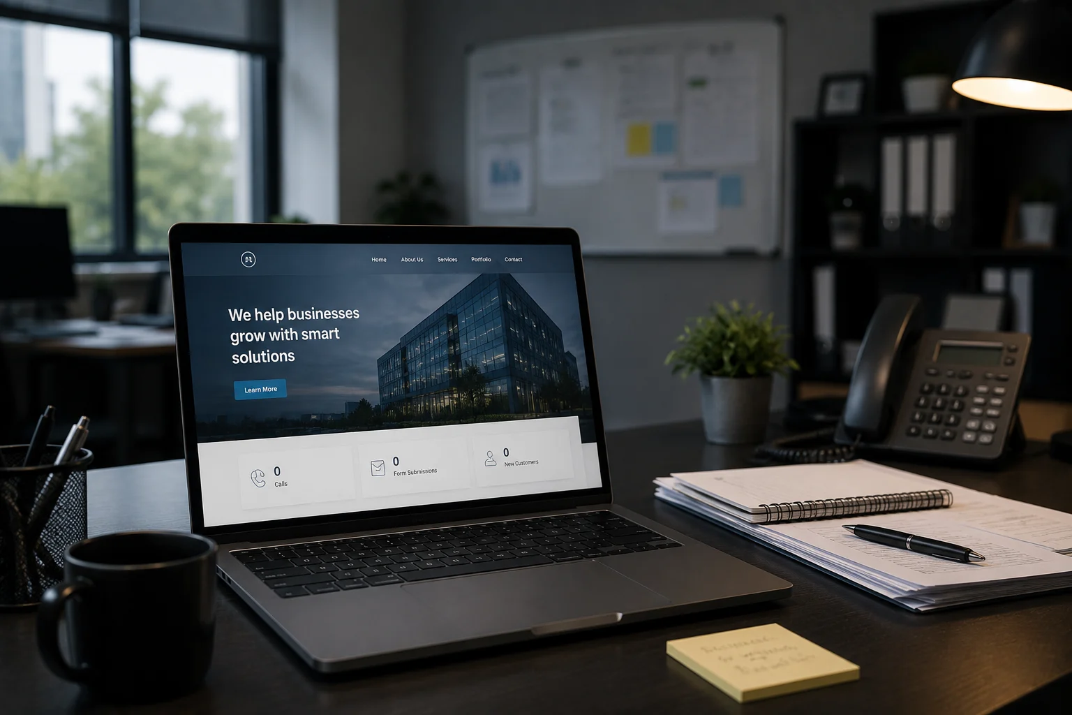
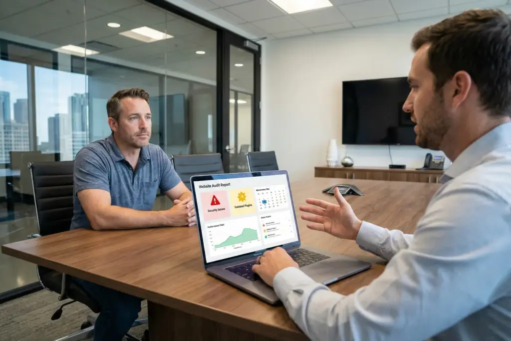
At Westport Osprey, we work with small businesses across Connecticut to build modern websites that load fast, look sharp, and keep visitors engaged.
What Do Users Actually Expect From Modern Web Design?
Modern web design meets expectations by combining fast load speeds, clean layouts, and intuitive navigation that guides visitors without confusion. People do not want to hunt for information. They scan web pages left to right, and expect the most important content to show up exactly where they look.
Good web design follows those user behavior patterns by design. A user-friendly website puts the right content in the right place, making every page feel natural to move through. That is what separates a site people trust.
The Visual Side: Color Palettes, Fonts, and First Impressions
Color palettes and typography are doing most of the attracting work. Before anyone reads a headline or clicks a button, the visual elements on your page have already set the tone. If visitors get those wrong, even great content will not save you.

Consistent visual language across every page builds trust and keeps user engagement strong. In fact, poor font sizing or clashing colors push people away faster than a slow load time ever would.
Below, we explain what delivers better results:
How Color Theory Guides the Way Users Feel
Get color theory right, and your web presence communicates trust, urgency, or calm before a visitor reads a single word. Different hues produce specific emotional responses, and web designers use that to guide their audience toward action.
For instance, blue builds trust, red creates urgency, and green signals safety across global audiences. Choosing the wrong palette for your target audience can undermine credibility.
If you own a financial services page using neon colors appears off immediately. That disconnect is something we see regularly with new clients coming to us from Westport and the surrounding Connecticut area.
Typography and Spacing as Core Design Elements
Color is only half the story. Typography and spacing are just as responsible for a polished page. For instance, tight spacing and small fonts make web pages feel cluttered, which cuts reading time significantly. Good typography uses contrast, hierarchy, and white space to guide the eye naturally down the page.
Font choices also communicate brand personality. A serif looks traditional and established, while a sans-serif reads as clean and current to most people browsing today.
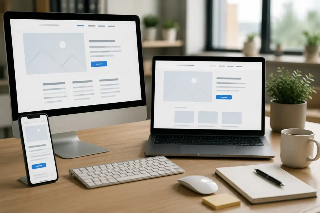
Mobile Responsiveness Is No Longer Optional
Mobile devices now account for over 50% of all global web traffic, according to StatCounter. Most of those people will leave a page that does not display properly on their phone, and they rarely return.
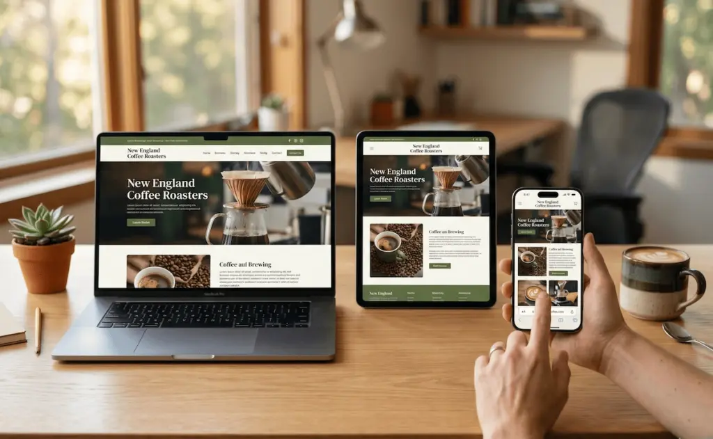
Mobile responsiveness means your layout, buttons, and text adjust automatically across different screen sizes. Search engines like Google rank mobile-friendly pages higher, so poor responsiveness hurts both user experience and search engine rankings directly.
Here is what a responsive website handles without any extra effort on your part:
- Flexible Layouts: Your web pages reformat automatically to fit any screen, from large desktop monitors to small smartphone displays. This creates a consistent browsing experience that keeps users engaged and reduces bounce rates (no matter how they access your site).
- Readable Text: No one wants to zoom in just to read. Font sizes adapt to different devices, keeping content clear, comfortable, and easy to scan at a glance.
- Optimized Images: Well-optimized visuals enhance both speed and user engagement. Images scale perfectly without distortion, helping pages load efficiently while maintaining a sharp, professional appearance on all screen sizes.
- Clickable Buttons: Easy navigation increases conversions. Buttons and links resize for touch screens, allowing users to navigate without frustration, especially on mobile devices.
A website that handles all four of these well gives your audience a smooth user experience, no matter how they find you.
Dark Mode, Hamburger Menus, and Other Latest Web Design Trends
Staying current with the latest web design trends is one of the fastest ways to keep visitors on your page longer and reduce bounce rates. After all, technological advancements move quickly, and audience expectations follow right behind them.
Today’s visitors notice when a website feels dated. Interactive elements like micro-animations, dynamic content, and personalized experience features have become part of what makes digital experiences feel fresh. Knowing which trends add real value versus which ones distract helps businesses make smarter decisions.
Dark Mode and Its Effect on User Engagement
Dark mode has gone from a novelty to a genuine preference for millions of people worldwide. Apple and Google both introduced system-wide dark mode across their platforms, and web designers followed quickly with matching options on their pages.
The appeal is practical. This setting reduces eye strain and extends screen time, especially for anyone browsing late at night. Not to mention, pages offering a dark theme toggle tend to see longer session durations, which is a positive signal for user engagement and search rankings.
The Hamburger Menu: Handy or Harmful?
That three-line icon in the corner of your screen has sparked more debate in web design circles than almost anything else. The hamburger menu hides navigation behind those three lines, saving screen space and keeping the home page clean for first-time visitors.
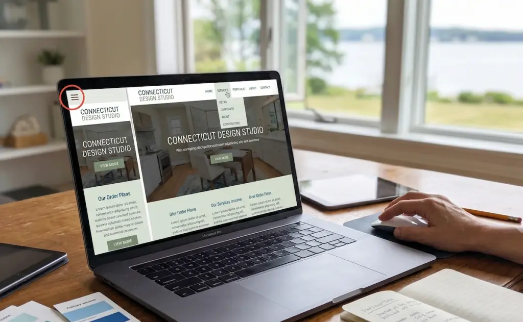
On mobile, it works well and allows users to tap through a tucked-away menu naturally. On desktop, though, it reduces discoverability and pushes bounce rates up by burying navigation that your audience expects to see immediately.
Quick Tip: Test navigation visibility against your conversion rate to decide whether a hamburger menu suits your build.
Key Elements That Define Good Web Design
Good web design comes down to a handful of important elements that every modern page should have in place. Take a look at this quick breakdown:
|
Element |
What It Does |
|
Visual Hierarchy |
Guides the eye to the most important content first |
|
White Space |
Reduces visual clutter and makes pages easier to read |
|
Mobile Responsiveness |
Ensures your build works cleanly across all screen sizes |
|
Page Speed |
Keeps people on the page and supports search engine rankings |
|
Call to Action |
Points visitors toward the next step on every page |
|
Usability |
Makes every interaction feel natural and user-friendly |
A well-designed website hits all six of these. Skipping usability tests before launch is one of the most common mistakes we see, and it shows up in bounce rates and poor search rankings.
Ready to Give Your Website a Modern Feel?
Modern website design trends move fast. Visitors expect clean layouts, fast load speeds, and design elements that feel current the moment they land on your page. Falling behind means losing people to sites that simply look and work better.
Fortunately, updating your online presence does not require starting from scratch. Small changes to your color palettes, typography, mobile responsiveness, and overall user-friendly structure can make a real difference to your conversion rate and search rankings.
Westport Osprey helps Connecticut businesses build modern web design that works. Reach out today and let us show you exactly what your page needs.