

Why Businesses Struggle to Explain What They Do on Their Homepage
Businesses struggle to explain what they do on their homepage because they know their own work too well. The more familiar you are with what you offer, the harder it gets to explain it the way a stranger needs to hear it.
That familiarity makes it easy to leave out the context a first-time visitor needs to understand what the business actually does. It covers everything the business does without ever answering the question the visitor is silently asking: is this the right place for me?
In this article, we break down why this happens, what it looks like in practice, and how to tell if your own homepage has the problem.
Let’s get started.
It’s Rarely a Homepage Design Problem
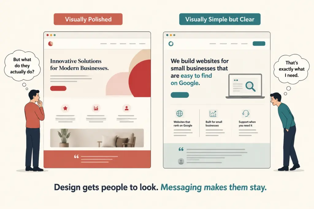
When a homepage isn’t converting, design is often the first thing blamed. Business owners start looking at fonts, colors, layouts, and animations. While design plays a role, it’s rarely the primary reason site visitors feel confused. The real issue is almost always what the page says and how clearly it says it.
That’s because visitors aren’t spending much time trying to figure a website out. Most people scan a page before they commit to reading it. This initial scan is when visitors form their first impression, often in as little as 50 milliseconds. In that brief moment, they’re trying to answer three basic questions:
- What does this business do?
- Is it relevant to me?
- Why should I care?
If those questions aren’t answered clearly, no amount of visual polish will keep them on the page. People need to understand what they’re looking at before they’re willing to take the next step.
You’re Too Close to Your Own Business
Ask most business owners to explain what they do, and they’ll give you a confident, detailed answer. But if you ask the same question to a first-time visitor to their homepage, you’ll often get a blank or uncertain answer. That gap exists because expertise creates blind spots. When you’ve spent years working in an industry, you forget which terms and concepts aren’t obvious to everyone else.
The same thing happens on business websites. Founders often skip the basics because they assume everyone already knows them. They write from an insider’s perspective instead of a visitor’s perspective. As a result, technical language, assumptions, and industry-specific details end up burying the information potential customers need.
That’s a common expert blind spot. The more knowledgeable you are, the harder it gets to recognize where visitors are getting lost.
Common Reasons Homepages Confuse Visitors
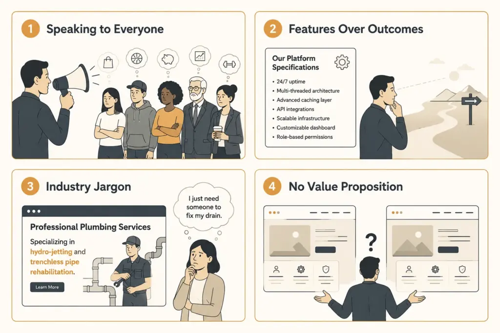
Most confusing homepages share a handful of common messaging problems. While every business is different, these issues show up surprisingly often.
Trying to Speak to Everyone
Many businesses want to attract as many potential customers as possible, so the homepage ends up with messaging broad enough to include everyone. But that broad messaging rarely feels relevant to anyone in particular. When a page tries to speak to everyone, the people who need it most may not feel like it’s meant for them.
Leading With Features Rather Than Outcomes
Businesses naturally focus on what they do, but visitors care more about what changes because of it.
Say you’re looking for workflow automation software and come across two homepages. One says “We provide cloud-based workflow automation software.” The other says “We help teams eliminate repetitive manual work.” Which one gives you a clearer reason to keep reading?
Probably the second, because it speaks to the result rather than the process.
Industry Jargon Gets in the Way
Every industry develops its own language. The problem is that customers don’t always speak it. For example, a plumber who lists “hydro-jetting and trenchless pipe rehabilitation services” knows exactly what that means. But most of their customers are just looking for someone to fix a blocked drain.
When visitors have to stop and work out what a page is trying to say, many won’t keep reading.
No Clear Value Proposition
Many homepages tell people what the business does but never explain why it’s the better choice. A visitor might learn what services are available, but not what makes this business different from the dozens of competitors offering the same thing.
A clear value proposition answers those questions directly and gives people a specific reason to choose you over anyone else. Without it, most prospects will simply move on to a business that has made its value clearer.
What a Clear Homepage Looks Like
A clear homepage doesn’t need clever wording or complicated marketing language. It needs to answer three questions as quickly as possible:
- What do you do?
- Who do you help?
- What result can customers expect?
Visitors shouldn’t have to hunt for those answers. The easier they are to find, the easier it is for people to decide whether they’re in the right place. Here’s how that difference looks in practice:
| What Many Homepages Say | What Visitors Understand More Easily |
| “We provide innovative digital solutions for modern businesses.” | “We build websites for small businesses in Connecticut that are easy to find on Google.” |
| “Our team of experts is dedicated to delivering excellence.” | “We’ve helped over 50 local businesses get online and start attracting new customers.” |
| “We offer a range of services to meet your needs.” | “Website design, SEO, and ongoing support, all in one place.” |
| “Contact us to learn more.” | “Get a free quote today, no obligation.” |
The examples on the right aren’t more creative, but they communicate much more clearly. Within seconds, visitors know what the business offers, who it’s for, and why it’s relevant to them. That clarity removes friction, encourages people to keep reading, and makes taking the next step feel much easier.
How to Tell If Your Homepage Has This Problem
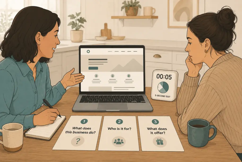
The good news is that homepage clarity is relatively easy to test.
One of the simplest methods is the five-second test. Show your homepage to someone who knows nothing about your business. Let them look at it for five seconds, then close the page. Ask them three questions:
- What does the business do?
- Who is it for?
- What does it offer?
If they struggle to answer any of those, your messaging probably needs work.
Another useful approach is to ask several people to describe your business after reading your homepage. If you get noticeably different answers from each person, that’s a sign your homepage is saying different things to different people.
We’ve used both of these tests while reviewing client homepages, and they consistently reveal the same issue. Business owners know exactly what they do, but first-time visitors often can’t explain it after a quick look. That’s usually where the messaging work begins.
Clarity Wins More Than Creativity
Fixing a confusing homepage doesn’t always require a complete redesign. Often, a clearer headline, simpler language, and a stronger focus on customer outcomes are enough to improve how visitors respond.
The tests covered above are a good place to begin. Use what you learn to refine your messaging and remove anything that makes visitors work harder than they should.
If you’re not sure where your homepage is falling short, Westport Osprey can help. We’ve reviewed homepages for businesses across Westport and Connecticut to uncover the messaging issues that often stand between a website and more inquiries.
Get in touch to see how a clearer homepage can start bringing in more inquiries.
Frequently Asked Questions
Unclear homepage messaging raises common questions about conversions, trust, and user behaviour. Below are answers to some of the most common ones.
Does homepage clarity affect my conversion rate?
Yes. When visitors land on a page and can’t quickly understand what a business offers, many leave without taking action. A clearer homepage reduces that friction and gives visitors a stronger reason to keep exploring, which can improve conversions over time. Even small messaging changes can have a noticeable impact.
Do trust signals really make a difference on a homepage?
They do, especially for visitors who are unfamiliar with your business. Social proof such as customer reviews, trust badges, case studies, and media mentions gives people more confidence before they contact you. Without these signals, even a well-written homepage can feel less trustworthy.
How does homepage messaging affect mobile users?
Mobile visitors often have less patience for unclear messaging because they are viewing content on a smaller screen. Clear headings, concise copy, and easy access to important information help them quickly understand what your business offers and what to do next.
Where else does unclear messaging show up on a business website?
The homepage is often the first interaction visitors have with your business, but unclear messaging can affect other important pages too. Service pages, landing pages, and contact pages all need to explain your offerings clearly. If visitors can’t understand what you provide or what to do next, they may leave before reaching out.
How do I know if my homepage changes are actually working?
Track how visitors interact with your page after making changes. Tools like Google Analytics can show whether conversions improve, how long users spend on the page, and which pages they visit next. Looking at these patterns helps you understand whether your new messaging is making it easier for visitors to take action.
Leave a Reply