Why Minimalist Design Wins: Simpler Pages, Faster Decisions
Minimalist design reduces cognitive load and helps users find what they need faster with less effort. To back this up, Nielsen Norman Group found that users are 47% more efficient when tasks are presented in clean, uncluttered formats.
People usually scan websites in seconds, and if they can’t immediately spot what they need, they’re gone. For example, if you have five call-to-action buttons, visitors will likely land on your page and freeze because there are too many elements competing for attention.
In this article, we’ll walk through how minimalist design pushes visitors toward action instead of confusion. We’ll also trace where this minimalist movement started, and show you which page elements you can cut to bring customers.
Let’s get faster conversions by next week.
What Is Minimalist Design? (And Why People Respond to It)
Minimalist design focuses on removing unnecessary elements so users can quickly understand the content and act without distraction. That’s why people find it easier and more satisfying to use. Think clean lines, plenty of white space, and a focus on one main action per page instead of ten competing buttons.
This style became popular in architecture and interior design back in the 1980s. Designers got tired of ornate, crowded looks and wanted something that felt neat. Ultimately, what worked for buildings and furniture turned out to work even better for websites.
The goal of this style is simple: make it easy for visitors to find what they want and take the next step without getting distracted by everything else on the page.

Your Brain on Minimalist Style: Why Less Feels Like More
Minimalist design aligns with how the brain processes information and makes experiences feel more intuitive. When a page removes distractions, the brain can prioritize what’s more important.
Here’s what happens inside your brain when you land on a minimalist page.
Fewer Choices Mean Faster Decisions
When people are presented with too many options, they usually hesitate or freeze up altogether. Psychologists call this response choice paralysis. Using this theory, reducing the number of visible options to just two or three can help visitors make decisions quickly and confidently.
We saw this firsthand while redesigning a Westport restaurant’s online ordering page last spring. By cutting the menu options in half, conversions increased by almost 42% within the first month.
Clean Layouts Give Your Eyes a Break
Your brain processes visual information faster when there’s breathing room between elements. Which is why white space guides attention to what’s important instead of making eyes dart around.
In fact, usability tests show that pages with more white space improve comprehension by up to 20%. It’s simply because the main elements are easier to notice and understand. That extra room creates an uncluttered space where essential elements stand out.
Simple Design Feels More Trustworthy
Busy pages with flashing buttons and popups can make users feel like the page is hiding something (yes, those sites that give off ‘used car salesman’ energy). Contrastingly, minimalist space looks professional and honest.
When the layout is clean and focused, visitors feel more at ease. And that sense of trust makes them far more willing to click the buy button.
The Origins of Minimalist Design Style
Ever wonder why every modern website looks cleaner than sites from 10 years ago? It’s because minimalist style kicked off when designers got tired of the ornate, crowded looks that felt stuffy and overdone.
This style has roots going back to the 1920s with movements like Bauhaus in Germany, but it really took off as a cultural force in the 1960s when artists and designers stripped away decoration across every creative field.

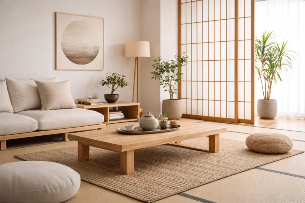
Then, architects like Mies van der Rohe pushed the concept of “less is more” in buildings and furniture. Along with that, Japanese interior design influenced Western minimalist interior design style with zen-like simplicity and natural materials. Those designs had clean lines, neutral colors, and only the bare essentials.
Funny how history repeats itself. These design principles ended up resurfacing when people realized that removing excess made spaces feel calmer and more honest.
Minimalist Design vs. Other Design Trends
If you’ve ever walked into a room and immediately felt calm versus one that made your eyes dart everywhere, you already understand the difference. The way a space looks changes how you feel in it.
Minimalist design sticks to the bare essentials. Say, a monochromatic palette with maybe one accent color, open plan layouts with breathing room, and no clutter competing for attention. Other design styles are usually heavier and decorative.
Here’s how minimalist design feels different from other popular styles.
| Design Style | Main Features | Best For |
| Minimalist | Neutral tones, clean lines, limited materials, no excess ornamentation | Business websites, landing pages, and apps that need quick decisions |
| Maximalist | Bold patterns, multiple textures, decorative pieces everywhere, vibrant colors | Creative portfolios, art galleries, and brands that want high energy |
| Modern | Bold shapes, glass and steel, statement pieces, tech features, strong geometric forms | Corporate sites, tech companies, and brands showing innovation |
| Scandinavian | Natural materials, simple forms, functional furniture, light wood, cozy minimalism | Lifestyle brands, home goods, wellness companies |
Different systems work for different goals, but minimalist design fits most business websites. Especially when you need people to take action fast, uncluttered aesthetics are perfect. This design philosophy removes everything that doesn’t help visitors complete their task.
Does Minimalist Space Help Unit Conversions?
In one word, yes. Minimalist design improves conversions by making pages easier to steer, speeding up decision-making, and building user trust. Now that you know why minimalist design feels better to visitors, here’s how it affects your actual business metrics.
Page Load Speed Gets Better With Fewer Elements
Every extra element on your page adds weight, and that weight translates directly into wait time for your visitors. When there are fewer images and scripts, it means pages load in under 2 seconds instead of 5.
Also, Google ranks faster sites higher, so you get more organic traffic automatically. These speed improvements hit two birds with one stone: they provide a better user experience and higher search rankings without requiring extra money on ads.

People Stay Longer When Pages Look Clean
We’ve seen visitors spend more time on minimalist pages because they’re easier to scan. When you strip away the visual chaos, people can focus on your content instead of getting overwhelmed.
After redesigning three client sites with cleaner layouts this year, we tracked session times that doubled compared to their old cluttered pages. Along with that, bounce rates also dropped because people weren’t hit with visual overload the second they landed.
Bare Essentials Design Makes CTRs Stand Out
Your call-to-action shouldn’t have to compete with five other buttons, three popups, and a sidebar full of distractions. When there’s one clear button on a clean background, click-through rates jump because visitors can now take an action
Conversion rate optimization gets easier when you remove distractions competing for attention. In short, give people one clear path forward, and they’ll take it.
Keep It Simple and See What Happens
Sometimes the best way to grow your business is by removing the things that are holding it back. When you strip pages down to only what’s important, visitors can move faster and convert more often. And minimalist design respects how people browse and make decisions online.
You don’t need a complete website overhaul to test this approach. We suggest starting with one high-traffic page and removing half the visual elements. Then observe what happens to your metrics over the next two weeks. With our recommended approach, most businesses see bounce rates drop and conversions climb within days.
If you’re looking for a team that understands minimalist design, Westport Osprey can help you. We’re experts in building pages that look clean and perform even better.


Leave a Reply