
The New Client Expectation Curve: What Customers Want From Websites in 2026
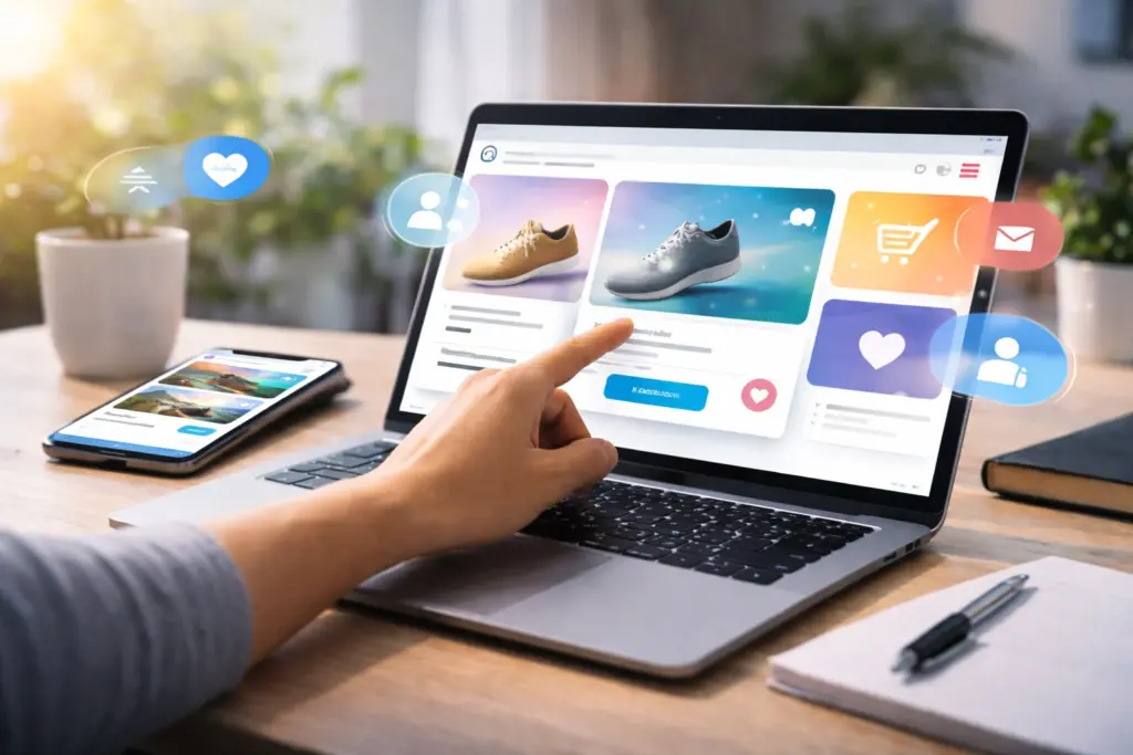
Customers in 2026 expect websites to load instantly and personalize their experience in real time. They also want your site to work flawlessly on mobile and have built-in accessibility features.
Our team at Westport Osprey has been building sites in Connecticut for years now. We’ve watched user needs evolve from basic contact forms to AI-powered personalization, and we know what makes a site easy to use and able to convert rather than frustrate people.
In this article, we’ll discuss what customers expect in 2026 and how we got here. You’ll also learn how to identify real user needs and what happens when you ignore those needs.
Ready? Let’s begin.
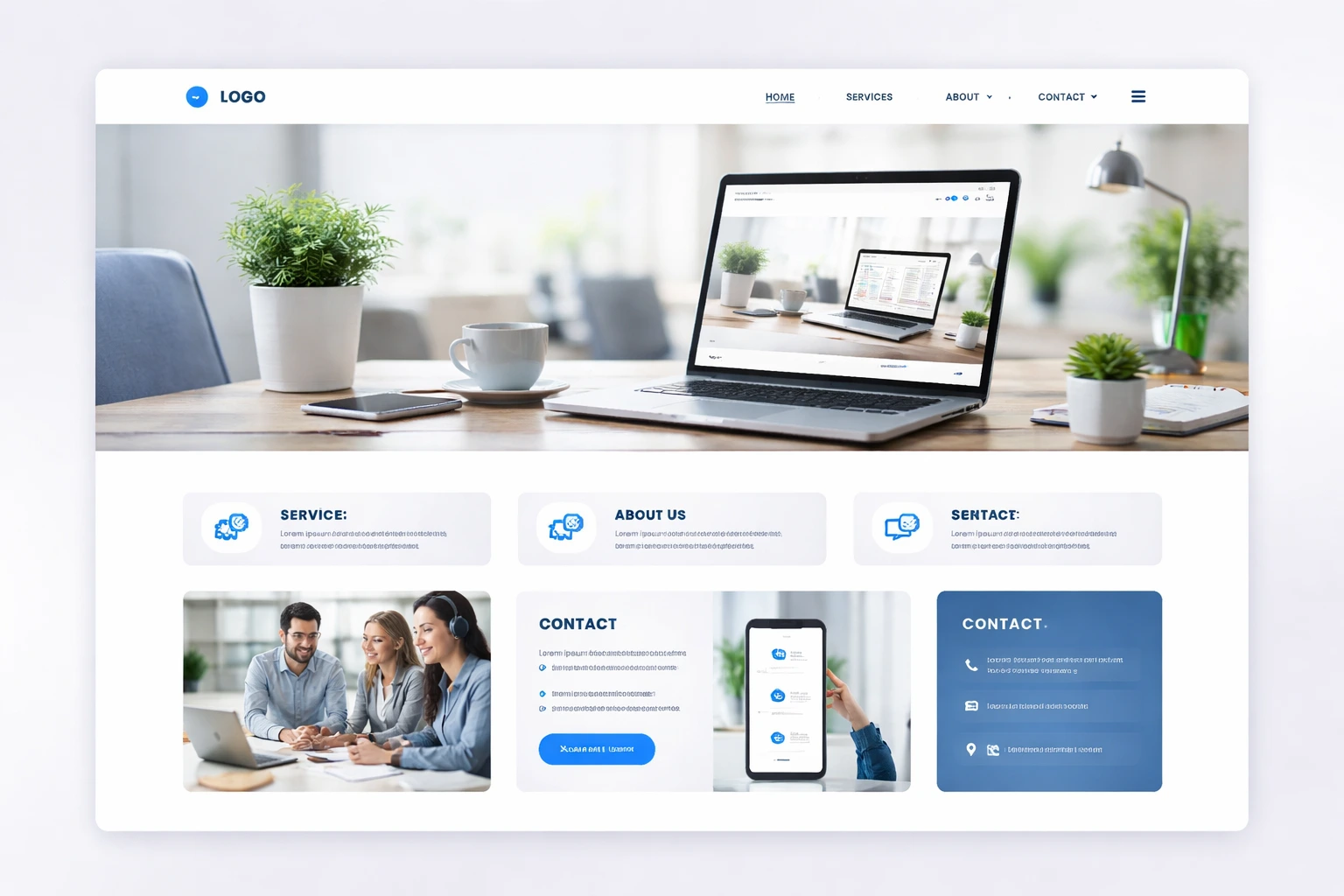
What Do Customers Expect From Websites in 2026?
Customers’ expectations from your site include fast loading times, simple personalization based on behavior, and a smooth mobile experience. They’re the baseline for staying competitive in 2026.

Here’s a detailed list of what customers want from your webpage in 2026:
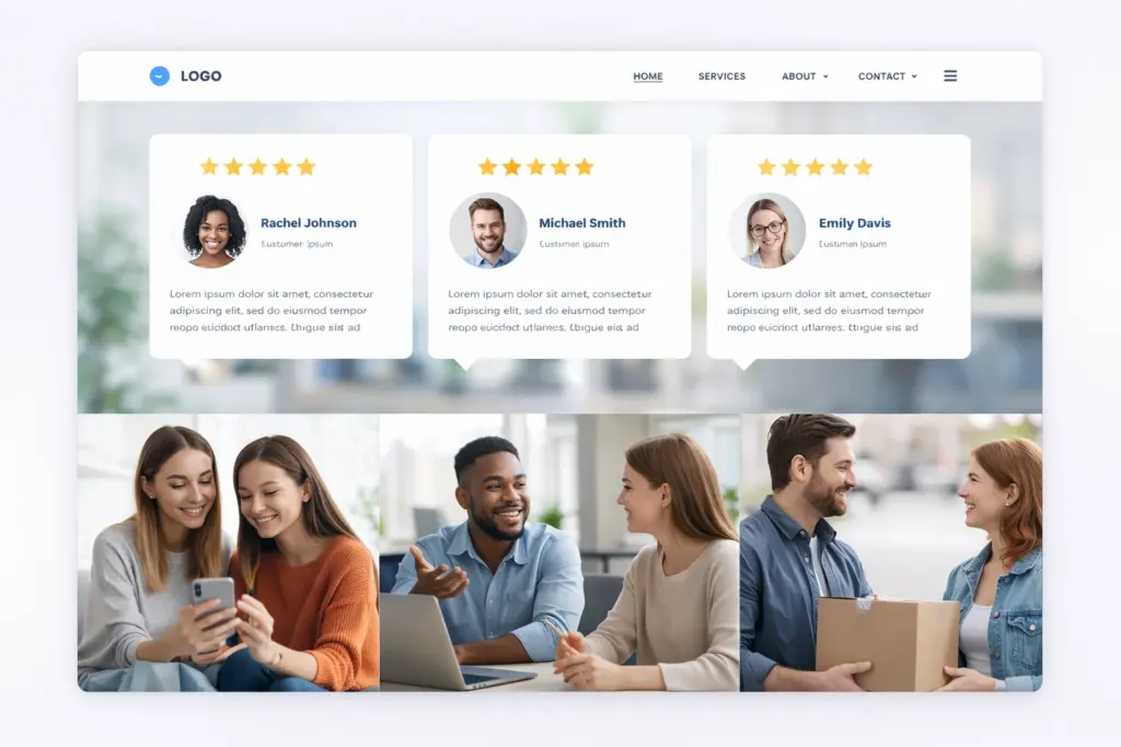
- Instant Personalization: Your site should adapt content and layout based on how you analyze user data from how someone actually uses it. For example, if a visitor browsed pricing pages last week, those items should move to the top this time. Plus, your headlines should change naturally to reflect what they showed interest in.
- Three-Second Load Times: According to BrowserStack, slow sites lose 40% of visitors when pages take longer than three seconds to load. It’s because mobile users are less likely to wait around, regardless of being on 5G or public WiFi.
- Built-In Accessibility: Visitors now expect websites to work smoothly with screen readers and keyboard navigation, since accessibility is part of basic usability. So, features like high contrast and clear alt text improve the experience for everyone, not just people with disabilities.
- AI-Powered Self-Service: The best thing about AI-powered self-services like chatbots is that they answer questions at 2 AM without human involvement. There are also other AI tools like Drift and Intercom that can qualify leads and book meetings while you sleep.
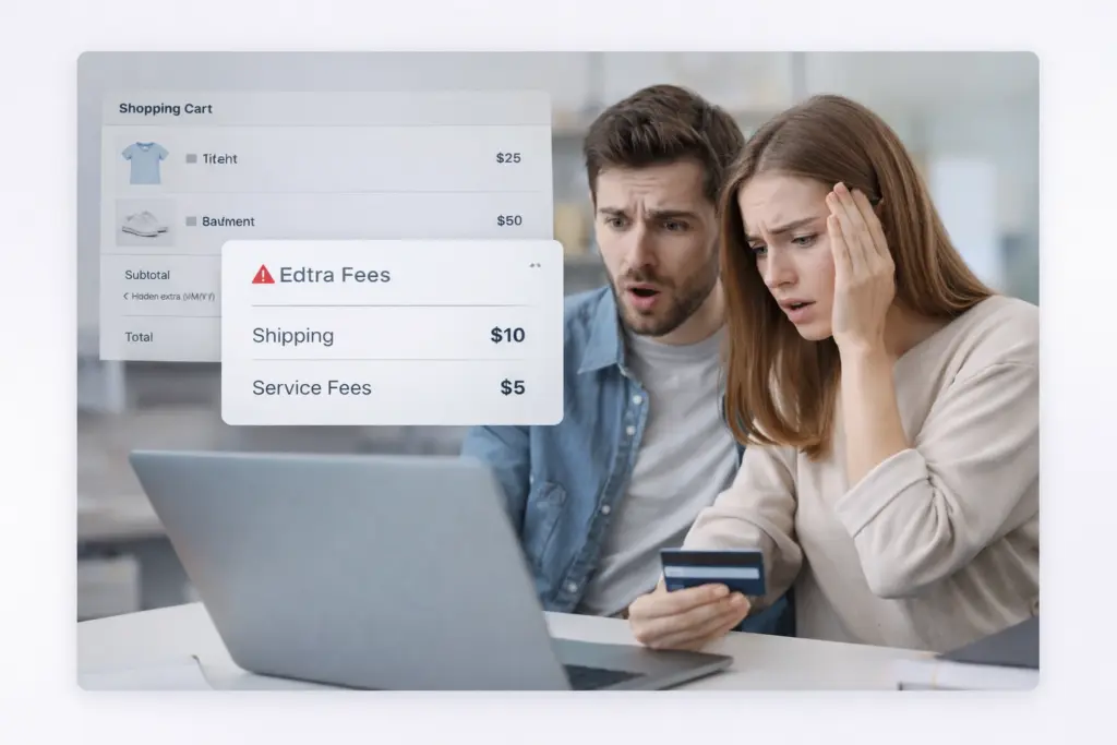
- Transparent Privacy Controls: Plain language is important to users because they’d like to know exactly what data you collect instead of seeing corporate speak about “improving experiences.” Also, you should offer easy opt-out options, which build trust by giving people control.
- Mobile-First Performance: As per Capital Counselor, 62% of global traffic comes from mobile devices nowadays. That’s why your sites must work perfectly on phones and tablets. Mobile performance also directly affects your search rankings and conversion rates.
Understanding these trends gives product managers a clear understanding of what to prioritize in the right features.
How Did We Get Here?
We got here through three distinct phases: the 2015-2020 static website era, when sites were digital brochures, the 2020-2024 mobile revolution driven by the pandemic, and the 2025 AI-driven personalization explosion.
Each shift raised the bar for what customers consider acceptable, which is why what felt cutting-edge five years ago now feels outdated.
We’ll now take a closer look at these changes.
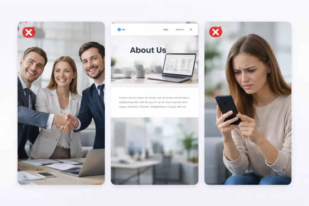
The 2015-2020 Static Website Era
Remember when having any website at all made you look professional? Back then, websites were digital brochures with basic contact forms. You’d list your services, add some photos, and call it done. Users expected information, but not much interaction or personalization.
During that era, desktop design came first, and mobile optimization was simply an afterthought. For this reason, designers built sites for big screens, then maybe squeezed everything down for phones if there was any budget left (that mindset wouldn’t survive now).
The 2020-2024 Mobile Revolution
The COVID pandemic in early 2020 forced everyone online. Suddenly, businesses that already prioritized mobile performance had a massive competitive advantage. Restaurants needed online ordering, while doctors offered telehealth services. Within months, your website became your storefront.
That is also when mobile traffic overtook desktop, and it made responsive design necessary. By 2021, over half of all web traffic came from phones. So users started expecting app-like experiences from regular websites with smooth animations and instant responses.
Why Expectations Jumped in 2025
AI tools showed users what personalization could actually deliver. For instance, ChatGPT launched in late 2022, and within a year, millions experienced truly adaptive interfaces. Once users saw what technology could do, they expected every website to be somewhat intelligent.
What’s more, the European Accessibility Act (EAA) made accessibility legally required starting mid-2025. It created a global snowball effect as businesses everywhere upgraded their sites.
The comparison table below will give you a clearer idea of the changes in the website expectation curve:
| Era | What Users Expected | What Technology Enabled | Business Impact |
| 2015-2020 | Basic information, contact forms, decent desktop experience | Responsive frameworks, basic CMS platforms | Website = digital business card |
| 2020-2024 | Mobile-first design, fast loading, e-commerce capability | Cloud hosting, progressive web apps, and advanced frameworks | Website = primary sales channel |
| 2025-2026 | AI personalization, sub-3-second loads, accessibility, self-service tools | AI assistants, edge computing, automation platforms | Website = intelligent business hub |
How Do You Actually Identify User Needs?
You can identify user needs by running surveys and interviews to gather user feedback. You should also focus on user observation with the help of analytics tools and prioritize features based on real impact.
Follow the strategies below to identify user needs through user research:
- Surveys and Interviews: Surveys let you gather data from hundreds of users in a few hours. However, interviews reveal the “why” behind the numbers. You just have to ask what users need to accomplish instead of what features they think they want.
- Focus Groups: Watching users react to mockups in real time can save you thousands in wasted development. More importantly, group discussions often surface problems that individual interviews miss because people build on each other’s frustrations and ideas.
- Analytics and Behavior Tracking: Heatmaps show where users actually click, which you’ll find is often completely different from where you assumed. And session recordings are even better because you’ll spot friction like broken forms or confusing navigation that analytics alone won’t detect.
- User Personas and Empathy Maps: If you design for a generic user, you risk creating something that doesn’t truly help anyone. That’s why empathy maps are useful in user centered design because they capture users’ thoughts and struggles. They also help you understand actual pain points rather than relying on assumptions.
- User Need Statements: These statements help teams stay focused on real problems, so they don’t add features just for the sake of it. In fact, a clear problem statement explains what a user needs to accomplish and keeps the team aligned on solving the right issue.
- Feature Prioritization: The truth is, you can’t address every user need at once. So we recommend focusing on the biggest pain points that affect the most people. Once you balance what users require with clear business objectives and a clear user story, you create something that can grow and last.
These techniques support an iterative design process that evolves as user needs change over time.
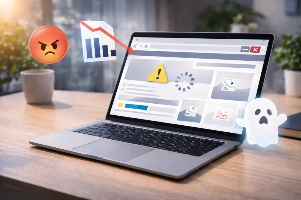
What Happens When You Ignore These Expectations?
When you ignore expectations and fail to address user needs, visitors leave quickly, engagement drops, and many users go to your competitors instead. Not only that, but poor experience signals can also hurt your visibility in search engines and reduce revenue.
Let’s get into more detail about these huge impacts.
Visitors Leave in Seconds
According to the World Health Organization (WHO), on its page “Disability,” around 1.3 billion people experience disability today. That’s roughly 16% of the global population, which means many potential users could be affected if a site isn’t accessible. And when that happens, users leave your site instantly.
But that’s not all. Generic experiences push different user segments toward competitors because the site doesn’t feel personal. If every visitor sees the same homepage regardless of their history, it fails to connect with the target audience and becomes easy to forget.
Search Rankings Drop
Did you know that Google uses page speed as a ranking factor in search results? Google confirmed it through the Page Experience and Core Web Vitals updates. It means slow sites can lose visibility, especially when competing with faster pages that have similar content quality.
The same goes for accessibility. Inaccessible sites rank lower because search engines pick up on metrics like engagement rates. So when visitors land on your site and leave right away, it signals that the page didn’t meet their expectations.
Over time, search engines use this kind of behavior as a sign that the page may not be a good match for the query.
Pro tip: Improve readability and content structure, since a clear hierarchy helps both users and search engines interpret relevance faster.
Your Next Step for Better User Experience
What users expect from websites keeps increasing, but most sites aren’t meeting those expectations. That’s why businesses that don’t improve accordingly lose both visitors and revenue.
But you don’t need to rebuild your entire site overnight to meet the requirements. Start with the basics like testing your mobile load speed, running a simple user survey, and watching how people go through your site. Those three actions alone will reveal problems you didn’t know existed.
And if you want experts to handle it for you, contact our team for a free website audit. At Westport Osprey Website Design, we help businesses with creating sites that actually meet user needs. Let’s connect and build something your customers will actually use.